text-wrap: balance and pretty: Solving Typography Headaches
A three-word first line with one word dangling awkwardly on the second has annoyed designers for decades. These two text-wrap values fix it without a single script tag or manual <br>.
Paul Radford — Full-Stack Developer & Editor. Paul is a full-stack developer and editor of template.tips. Articles here are AI-drafted and reviewed by Paul, who knows the code well enough to catch what's wrong and cut the hype.
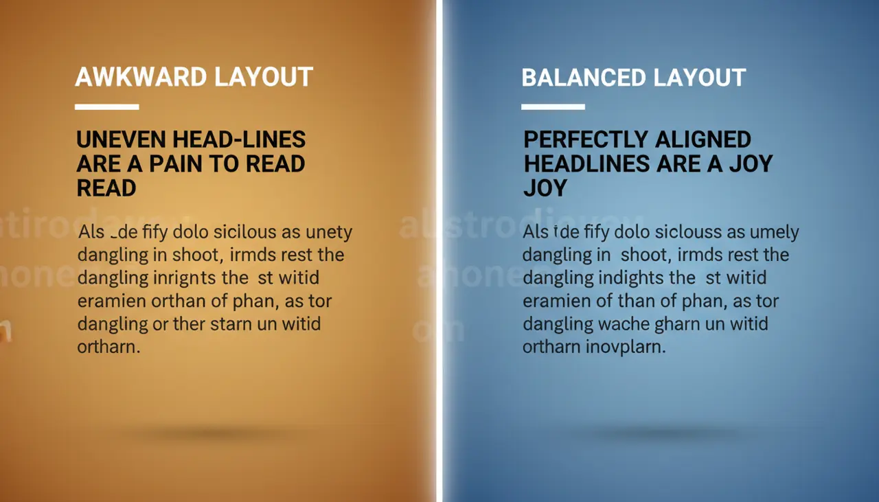
text-wrap: balance evens out line lengths in headings by redistributing text across lines, while text-wrap: pretty improves body copy by avoiding orphans and single-word last lines. Both are CSS-only fixes for ragged, unbalanced text wrapping that previously required JavaScript libraries or manual <br> tags.
Why does text wrapping even need fixing?
Browsers have always wrapped text using a greedy algorithm: fill each line with as many words as fit, then move to the next line. This works fine for paragraphs but produces ugly results in headings, especially multi-line ones. You get a three-word first line and a single dangling word on the second. Designers have complained about this for decades, and the usual fix was inserting manual line breaks that fall apart the moment someone changes the viewport width or the font size.
The CSS Text Module Level 4 spec introduced text-wrap values specifically to address this without JavaScript. The two values developers care about most are balance and pretty, and they solve different problems.
What does text-wrap: balance actually do?
balance tells the browser to distribute text evenly across all lines in a block, rather than greedily filling each line until it runs out of room. It's designed for short blocks of text: headings, pull quotes, button labels, card titles.
1/* Headline that balances across 2-3 lines */2.hero-heading {3 text-wrap: balance;4 font-size: 3rem;5 line-height: 1.1;6 max-width: 40ch;7}The browser calculates the ideal line count first, then works backward to find break points that make each line roughly the same length. The visual difference is obvious on headings that would otherwise leave one short word stranded on its own line.
The catch: balance only works up to a browser-imposed line limit. Chromium-based browsers cap it at 10 lines before falling back to normal wrapping. That's a deliberate performance guard, since balancing requires the browser to test multiple layout passes, and doing that for a 40-line paragraph would be expensive. This is exactly why you should not reach for balance on body copy. It's a headline tool, not a paragraph tool.
What does text-wrap: pretty fix that balance doesn't?
pretty targets a different failure mode: orphans. That's when the last line of a paragraph contains only one short word, or when a line break lands in an awkward spot mid-sentence. Unlike balance, pretty doesn't try to even out every line. It just applies extra logic to avoid the ugliest outcomes, particularly on the final line.
1/* Body copy that avoids single-word orphan lines */2.article-body p {3 text-wrap: pretty;4 max-width: 65ch;5}Because pretty doesn't attempt full balancing, it's cheaper computationally and safe to apply broadly across long-form content. You can put it on every paragraph in an article without worrying about the line-count ceiling that limits balance.
The difference in intent matters here. balance optimizes for visual symmetry across an entire block. pretty optimizes for avoiding specific bad patterns while mostly leaving the greedy algorithm alone. They are not interchangeable, and using balance where you mean pretty (or vice versa) will give you a result that looks subtly wrong for the content type.
How do you decide which one to use where?
Use balance for anything short and prominent where visual weight matters more than reading flow: page titles, hero headlines, card headers, modal titles, button text that wraps. These are places where an asymmetric wrap looks like a design mistake.
Use pretty for anything long-form where reading flow matters more than symmetry: article bodies, product descriptions, blog post paragraphs, FAQ answers. You don't want the browser aggressively reshaping a five-line paragraph, you just want it to not end on "the" by itself.
A practical pattern I use on client sites:
1/* Global baseline: balance headings, prettify body text */2h1, h2, h3 {3 text-wrap: balance;4}56p, li, dd {7 text-wrap: pretty;8}910/* Opt specific short UI labels into balance too */11.card-title,12.button-label,13.pull-quote {14 text-wrap: balance;15}This gives you sensible defaults without having to hand-tune every element. Note that text-wrap: balance on h1 through h3 is generally safe because headings rarely exceed the 10-line Chromium cap, but if you have a design with unusually long, multi-line headings (say, a news site with verbose headline styles), check rendered output at your actual breakpoints rather than assuming it works.
Where does browser support actually stand?
As of early 2026, both values ship in Chrome and Edge starting from version 114 (June 2023), and in Safari from version 17.5 (May 2024). Firefox shipped text-wrap: balance in Firefox 121 (December 2023) but pretty landed later, in Firefox 127 (June 2024). Check the MDN compatibility table or caniuse before relying on this for a project with strict legacy support requirements, since exact version numbers shift as browsers patch and backport.
The good news is that both properties degrade gracefully. Unsupported browsers simply ignore the declaration and fall back to normal greedy wrapping, which is the same behavior you had before adopting these properties. There's no broken layout, no missing content, just a slightly less polished line break. That makes this a genuinely safe progressive enhancement: you can ship it today without a fallback branch, without a feature query, and without JavaScript detection.
If you do want to gate behavior for older browsers that don't support either value, @supports works fine:
1/* Optional: explicit feature detection if you need a distinct fallback */2@supports (text-wrap: pretty) {3 .article-body p {4 text-wrap: pretty;5 }6}In practice I rarely bother with the @supports wrapper for this specific feature, because the ungated fallback (plain greedy wrapping) is already acceptable. Save @supports for cases where the fallback would look actively broken.
What are the gotchas nobody mentions?
A few things caught me off guard when I first used these in production.
First, balance recalculates on every resize and every font load. If you're loading a custom web font asynchronously, the heading might visibly reflow once the font swaps in, because the balance calculation runs against the fallback font metrics first, then again once the real font is available. This is usually a non-issue, but on slow connections it can cause a visible jump. If that bothers you, pair it with font-display: optional or preload your critical heading font.
Second, balance does not work with white-space: nowrap or on inline elements. It requires a block-level (or block-like) formatting context. If you apply it to a <span> inside a paragraph expecting it to balance just that span's wrapped text, it won't do anything, since the property operates on the block container's line box distribution, not on arbitrary inline runs.
Third, neither property interacts predictably with hyphens: auto. If you have both enabled, test the actual rendered output at your target breakpoints. Hyphenation can interfere with how the browser calculates optimal break points for balancing, and the combined result sometimes looks worse than either property alone. I've had cases where turning off hyphens on balanced headings produced a cleaner result than trying to combine both.
Fourth, and this is the one that trips people up in QA: balance behaves differently depending on container width relative to content length. A heading that balances beautifully at 800px wide might revert to a lopsided two-line split at 320px, simply because there are fewer valid break points available. Don't assume that testing one viewport width validates the whole responsive range. Check your narrowest supported breakpoint specifically, since that's where balancing has the least room to work with.
How should you actually test this before shipping?
Don't just eyeball it in Chrome DevTools at your default window size. Resize the viewport across your full supported range, from your narrowest mobile breakpoint up through your widest desktop layout, and watch how headings reflow at each step. Pay attention to the moment a heading crosses from two lines to three, since that's often where balancing produces a temporarily awkward split before settling.
Test with real content, not lorem ipsum. Placeholder text has statistically even word lengths that make balancing look better than it will with your actual headline copy, which might have a mix of a ten-letter word and three two-letter words.
Finally, check your fallback rendering in a browser that doesn't support the property yet (or temporarily comment out the declaration) so you know what the "worst case" looks like for users on older engines. If that worst case is acceptable, and per the CSS Text Module Level 4 spec it should degrade to standard greedy wrapping, you can ship the enhancement with confidence and move on to the next layout problem.
Related Articles
Fluid Typography with clamp(): Beyond Static Breakpoints
A heading that jumps from 28px to 36px at a single pixel breakpoint looks jarring on foldables and split-screen tablets alike. clamp() removes that visual seam completely.
Custom List Markers with @counter-style: Beyond Bullet Points
Faking custom bullets with generated content strips list position entirely from screen reader announcements. @counter-style plugs into list-style-type without losing that native semantics.
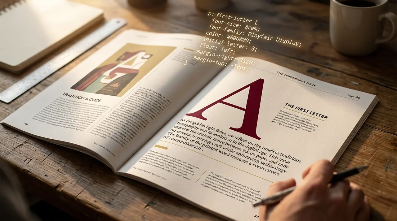
initial-letter: Creating Professional Drop Caps Without Images
The old float: left drop cap trick clips descenders on letters like 'g' and 'j' because floats never understood baseline alignment. initial-letter finally fixes that at the spec level.