Fluid Typography with clamp(): Beyond Static Breakpoints
A heading that jumps from 28px to 36px at a single pixel breakpoint looks jarring on foldables and split-screen tablets alike. clamp() removes that visual seam completely.
Paul Radford — Full-Stack Developer & Editor. Paul is a full-stack developer and editor of template.tips. Articles here are AI-drafted and reviewed by Paul, who knows the code well enough to catch what's wrong and cut the hype.
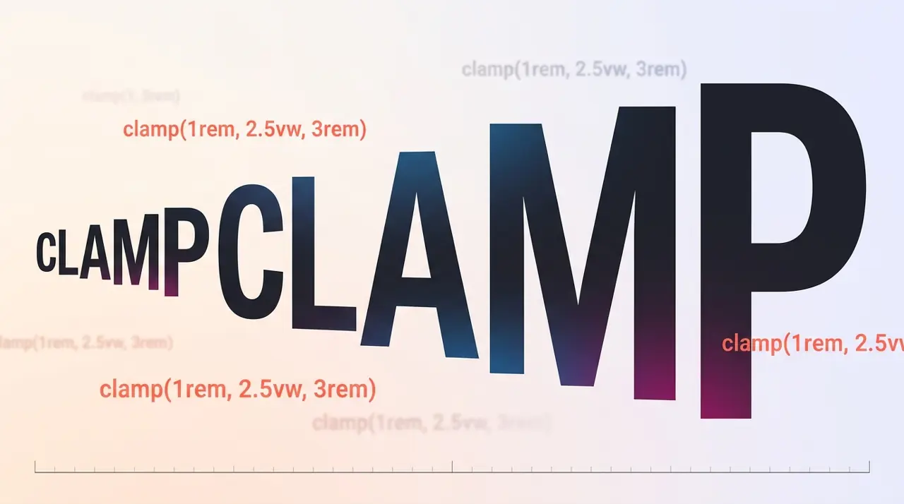
CSS clamp(min, preferred, max) lets font size scale continuously with viewport width using a single declaration, replacing the stair-step feel of @media breakpoints. You set a floor, a fluid value tied to vw or rem, and a ceiling, and the browser interpolates between them on every resize, no JavaScript and no jump cuts.
Why breakpoints feel wrong once you've used clamp()
Media query typography works in discrete steps. At 767px a heading might be 28px, and at 768px it suddenly becomes 36px. Resize a browser window slowly and you can watch the text jump, which looks jarring on foldables, split-screen tablets, or anyone dragging a window between two monitors of different DPI.
clamp() removes the seams. The browser recalculates the computed value on every layout pass, so text grows or shrinks in lockstep with the container. This matters most on real devices with variable viewport widths: a Samsung Fold unfolded, a Windows laptop with a snapped app pane, a browser at 83% zoom. None of these fit cleanly into three or four breakpoints, and trying to cover them with more media queries just adds maintenance debt.
The tradeoff is that fluid values are harder to eyeball. You cannot glance at a stylesheet and know that a headline is exactly 42px on an iPad. You get a range, and you have to trust the math or test it.
What does clamp() actually do
1/* Basic syntax: clamp(minimum, preferred, maximum) */2h1 {3 /* Never smaller than 1.75rem, never larger than 3.5rem,4 scales fluidly in between based on viewport width */5 font-size: clamp(1.75rem, 4vw + 1rem, 3.5rem);6}The preferred value is the one that does the scaling. 4vw alone would not work well because it has no base offset, so on very narrow phones it would shrink too aggressively. Adding + 1rem gives it a floor-like buffer inside the calculation itself, which softens the curve near the minimum edge.
The unit choice in the preferred value matters:
- vw ties scaling purely to viewport width, ignoring the user's root font size.
- rem in the preferred slot (mixed with vw) respects the user's browser zoom and OS-level text size settings.
- Pure vw values fail accessibility checks that require text to reflow properly when a user increases browser zoom without changing the OS font size, because vw is calculated against the viewport, not the font scaling factor.
If you care about WCAG 1.4.4 (Resize Text), avoid pure vw based clamps for body copy. Mixing in rem or em in the preferred value, as in the example above, keeps the fluid size anchored to relative units rather than the raw pixel width of the screen.
How do you pick the min and max values without guessing
Guessing min and max in isolation leads to headlines that look right on your 1440px monitor and wrong everywhere else. A more reliable process:
- Decide the smallest viewport you support (often 320px to 360px) and the largest you care about (1440px to 1920px covers most desktop use).
- Pick the font size you want at each extreme using a type scale you already trust (a modular scale, or just values from your design system).
- Solve for the slope so the preferred value crosses through both points.
The formula for the linear part looks like this:
1slope = (max_size - min_size) / (max_viewport - min_viewport)2preferred_vw = slope * 1003intercept = min_size - slope * min_viewportFor a headline that should be 28px at a 360px viewport and 56px at a 1600px viewport:
1/* Computed from: 28px at 360px viewport, 56px at 1600px viewport2 slope = (56 - 28) / (1600 - 360) = 0.02263 preferred_vw = 0.0226 * 100 = 2.26vw4 intercept = 28 - (0.0226 * 360) = 19.87px -> convert to rem */5h1 {6 font-size: clamp(1.75rem, 1.24rem + 2.26vw, 3.5rem);7}Doing this by hand every time is tedious. Utopia's fluid type calculator and similar tools generate the clamp expression from your min/max pairs, and I use one whenever I set up a new type scale rather than hand-deriving the slope each time. The math above is worth understanding once so you can debug or adjust generated values later, not something you need to redo by hand on every project.
When clamp() is the wrong tool
Fluid typography earns its keep on marketing pages, editorial layouts, and hero sections where a headline's visual weight matters at every viewport width. It is a poor fit in a few specific cases.
Dense data tables and UI chrome (button labels, form field labels, table headers) usually read better at a fixed size that matches a defined design system token. Letting a "14px" label fluidly become "13.2px" on a slightly narrower viewport adds visual noise without any real benefit, and it breaks pixel-perfect alignment with icons or fixed-height controls.
Print stylesheets should not use clamp() with viewport units at all. vw and vh are not meaningful in a print context in the same way, since @media print typically renders against page dimensions, and behavior across browsers and print engines is inconsistent. Use fixed pt or in values in your print rules instead.
Very old browser support is a non-issue at this point. clamp() has shipped in every major evergreen browser since 2020, including Chrome 79, Firefox 75, and Safari 13.1, and current caniuse data shows near-universal support. The one real gotcha is Safari's historically shaky handling of calc() nested inside clamp() in some pre-13.1 point releases, so if you still support Safari versions from before mid-2020 (unlikely on any modern analytics dashboard), test explicitly rather than assuming.
Combining clamp() with container queries
Viewport-based fluid type breaks down inside components that do not span the full viewport width, like a card in a sidebar or a modal. A headline inside a 320px-wide card should not scale based on a 1920px viewport, because the card itself never gets that wide.
Container queries combined with container query units (cqw, cqi) solve this by letting the fluid calculation reference the container's inline size instead of the viewport:
1/* Card headline scales with its own container width,2 not the page's viewport width */3.card {4 container-type: inline-size;5}67.card h2 {8 /* cqi = container query inline size, falls back gracefully9 in browsers without container query support if you add10 a static fallback declaration above this line */11 font-size: clamp(1.25rem, 1rem + 2cqi, 1.75rem);12}Support for container query units landed in Chrome 105, Firefox 110, and Safari 16, all in 2022 to 2023, so as of 2026 this is safe for any project that has already dropped support for browsers older than three or four years. If you need to support older engines, ship a static font-size fallback declaration before the clamp() line; CSS simply overrides it when the newer syntax is understood, and ignores the whole declaration when it is not.
Testing the result properly
Resizing a desktop browser window is not a real test. Open DevTools' responsive mode and drag through the full width range you designed for, watching specifically for two failure modes: line-length changes that break your vertical rhythm (a heading wrapping to three lines instead of two at some awkward mid-point), and letter-spacing or line-height values defined in fixed units that stop matching the now-fluid font size.
Check zoom behavior separately from viewport width. Set browser zoom to 200% at a fixed viewport and confirm the text does not get clipped by a max() ceiling that was tuned only for desktop viewing. Then check it again with the OS-level text size increased instead of browser zoom, since some platforms handle that differently.
Finally, load the page on at least one real phone and one real tablet, not just a device emulator. Emulators fake the viewport dimensions correctly but they don't always reproduce quirks in how mobile Safari or Samsung Internet round subpixel values during the clamp() calculation, and rounding differences of half a pixel occasionally show up as text that wraps one word earlier than your desktop preview suggested.
Related Articles
Custom List Markers with @counter-style: Beyond Bullet Points
Faking custom bullets with generated content strips list position entirely from screen reader announcements. @counter-style plugs into list-style-type without losing that native semantics.
initial-letter: Creating Professional Drop Caps Without Images
The old float: left drop cap trick clips descenders on letters like 'g' and 'j' because floats never understood baseline alignment. initial-letter finally fixes that at the spec level.
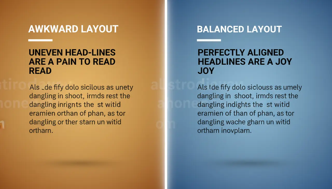
text-wrap: balance and pretty: Solving Typography Headaches
A three-word first line with one word dangling awkwardly on the second has annoyed designers for decades. These two text-wrap values fix it without a single script tag or manual <br>.