initial-letter: Creating Professional Drop Caps Without Images
The old float: left drop cap trick clips descenders on letters like 'g' and 'j' because floats never understood baseline alignment. initial-letter finally fixes that at the spec level.
Paul Radford — Full-Stack Developer & Editor. Paul is a full-stack developer and editor of template.tips. Articles here are AI-drafted and reviewed by Paul, who knows the code well enough to catch what's wrong and cut the hype.
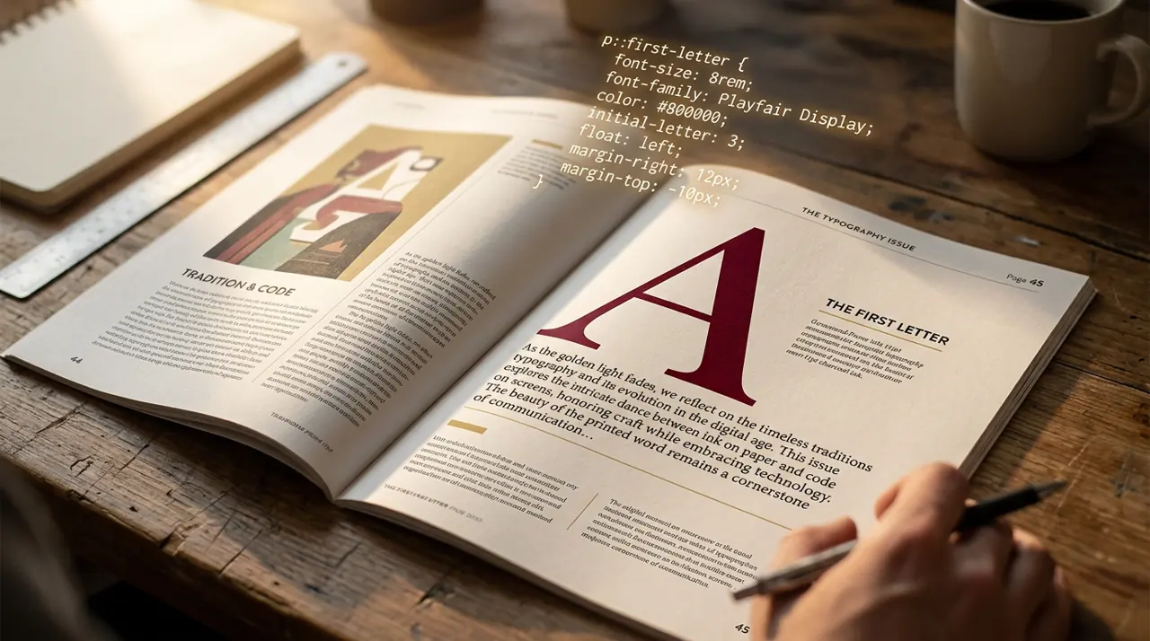
The initial-letter CSS property lets you create typographically correct drop caps by controlling how many lines a large first letter spans and sinks into the paragraph, without slicing images or hand-tuning float and line-height hacks. It is the direct CSS answer to a design pattern print typographers have used for centuries.
Why Did Drop Caps Need Their Own CSS Property?
Before initial-letter, developers faked drop caps with float: left on a span, then adjusted font-size, line-height, and margin by trial and error until the letter roughly matched three or four lines of body text. This works, sort of, but it breaks the moment you change the font, the paragraph width, or the viewport size. The float approach also has a specific failure mode: descenders on letters like "g" or "j" get clipped or overlap the text below because floats don't understand baseline alignment across multiple lines.
initial-letter was built to solve exactly this. It ties the glyph's size and position to the line grid of the surrounding text, so the letter's cap height and baseline snap to specific lines rather than being eyeballed. The CSS Inline Layout specification defines the property as controlling "the size and baseline alignment of the first letter" of a block, independent of font-size.
Basic Syntax and What the Numbers Mean
The property takes one or two numbers:
1/* Single value: sink is derived automatically */2p.drop-cap: :first-letter {3 initial-letter: 3;4}56/* Two values: size (lines occupied) and sink (lines the baseline drops) */7p.drop-cap: :first-letter {8 initial-letter: 4 3;9}The first number is the size, roughly how many lines tall the letter should appear. The second, optional number is the sink, how many lines down the letter's baseline should be pushed. If you omit the sink, the browser picks a sensible default (usually size minus a fraction, rounded).
In practice, size 3 or 4 is the sweet spot for body copy. Anything above 6 starts looking like a poster headline rather than a drop cap, and anything below 2 barely reads as a drop cap at all.
A Complete, Copy-Paste Example
Here's a realistic setup you'd actually ship, including fallback behavior for browsers that don't support the property yet.
1/* Drop cap for the first paragraph of an article body */2.article-body > p: first-of-type::first-letter {3 initial-letter: 3 3; /* modern syntax: size 3, sink 3 */4 -webkit-initial-letter: 3 3; /* Safari uses this prefix as of Safari 17 */5 font-weight: 700;6 color: #1a1a1a;7 font-family: ";Georgia", serif;8}910/* Fallback for browsers with no support at all: float-based approximation */11@supports not (initial-letter: 3) {12 .article-body > p: first-of-type::first-letter {13 float: left;14 font-size: 3.2em;15 line-height: 0.85;16 padding-right: 0.08em;17 font-weight: 700;18 }19}1<!-- Markup stays plain, no wrapping span needed -->2<article class="article-body">3 <p>Once the initial letter of a paragraph is styled this way, the4 browser handles line-box calculations automatically, so the rest5 of the text reflows correctly around the enlarged glyph.</p>6</article>Notice that the fallback lives inside @supports not (...), not the other way around. Writing the modern rule first and gating the legacy hack behind a negative feature query keeps your CSS shorter and avoids specificity fights between the two rulesets.
How Does Sink Actually Affect the Baseline?
This is the part that trips people up. Sink does not mean "how many lines tall the letter looks." It means "how many lines down from the top of the size box the letter's baseline sits." If you set initial-letter: 4 2, the letter occupies a box four lines tall, but its baseline aligns with the second line of body text, meaning the top of the letter extends above the first line of the paragraph.
For most Western scripts, matching size and sink (like 3 3 or 4 4) produces a classic look where the cap height aligns with the top of the first line and the baseline aligns with the last line the letter spans. Mismatched values are useful for stylistic effects, like a drop cap that appears to hang above the text block, but they require testing with your actual font, since ascender and descender proportions vary a lot between typefaces.
Browser Support: The Part That Still Matters in 2026
This is where initial-letter demands caution. As of early 2026, support is uneven:
- Safari has supported -webkit-initial-letter since Safari 9 (2015), and unprefixed initial-letter landed in Safari 17.
- Chrome and Edge shipped unprefixed support starting in Chrome 133, released in early 2025.
- Firefox still has no support as of Firefox 134, tracked in Mozilla's bug tracker, meaning any production use needs a fallback path.
Check caniuse.com's initial-letter table before you rely on this for anything beyond a progressive enhancement. Firefox's absence is the real blocker: if a meaningful share of your traffic runs Firefox, ship the @supports fallback shown above rather than treating initial-letter as your only styling path.
There's also a rendering nuance worth knowing: even in supporting browsers, initial-letter calculations depend on font metrics that vary between font files. A serif face with tall ascenders and a geometric sans with a small x-height will produce visually different sink amounts even with identical CSS values, because the spec ties the sizing to the font's own cap-height and baseline metrics, as described in the MDN reference for initial-letter. Always preview with your production web font, not a system font, before locking in sink values.
When Should You Skip initial-letter Entirely?
Don't reach for this property in a few situations:
If you're building for email clients, skip it outright. Email rendering engines are years behind browser CSS support and initial-letter won't render in any mainstream mail client as of 2026. Use an image or a table-based hack there instead.
If your design system needs pixel-identical drop caps across Chrome, Safari, and Firefox today, initial-letter isn't ready to be your only mechanism. The float-based fallback should be treated as the primary implementation with initial-letter as a progressive enhancement layered on top for browsers that support it, not the reverse.
If you're styling a multi-column layout where the first letter needs to interact with a pull quote or a floated image nearby, test extensively. Interactions between initial-letter and other float or shape contexts are underspecified in practice and Chrome and Safari don't always agree on edge cases involving overlapping floats.
Testing Your Implementation
Once you've written the CSS, verify it the way a print typographer would check a proof: zoom into the paragraph at 200% and confirm the drop cap's baseline actually lines up with a text baseline below it, not just visually "close enough." Resize the browser window to trigger reflow and confirm the letter recalculates rather than getting orphaned at a stale size. Swap in your real web font (not a fallback system font) because metric differences between fonts can shift the sink by several pixels. Finally, disable JavaScript and CSS custom properties temporarily to confirm your @supports fallback renders sensibly on its own, since that's the version Firefox users will actually see until support lands.
If you maintain a component library, it's worth building a small test page with three or four representative fonts and paragraph widths, then screenshotting it in Chrome, Safari, and Firefox side by side. That fifteen-minute check will tell you more about how this property behaves in your specific stack than any spec reading will.
Related Articles
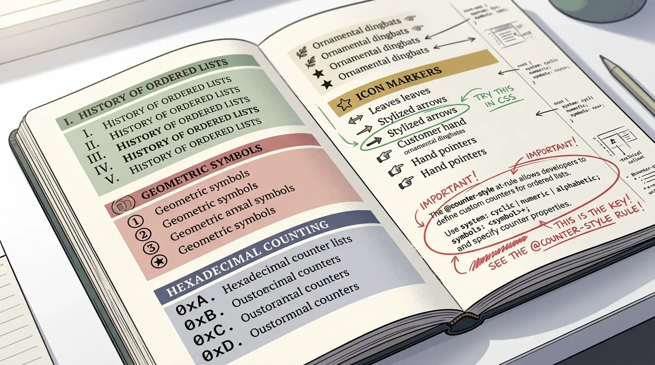
Custom List Markers with @counter-style: Beyond Bullet Points
Faking custom bullets with generated content strips list position entirely from screen reader announcements. @counter-style plugs into list-style-type without losing that native semantics.
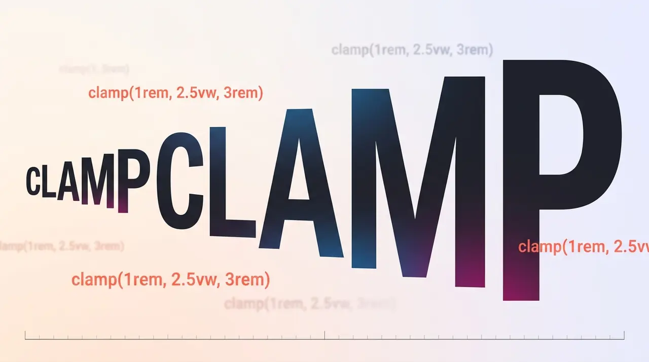
Fluid Typography with clamp(): Beyond Static Breakpoints
A heading that jumps from 28px to 36px at a single pixel breakpoint looks jarring on foldables and split-screen tablets alike. clamp() removes that visual seam completely.
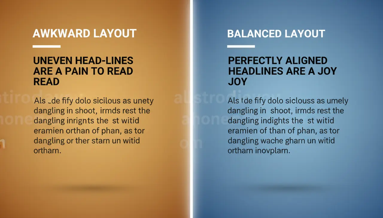
text-wrap: balance and pretty: Solving Typography Headaches
A three-word first line with one word dangling awkwardly on the second has annoyed designers for decades. These two text-wrap values fix it without a single script tag or manual <br>.