light-dark(): The Simplest Way to Handle Color Mode Switching
Forty color tokens duplicated inside a prefers-color-scheme media query block is forty places to miss an override somewhere. light-dark() collapses that pattern into one line per property.
Paul Radford — Full-Stack Developer & Editor. Paul is a full-stack developer and editor of template.tips. Articles here are AI-drafted and reviewed by Paul, who knows the code well enough to catch what's wrong and cut the hype.
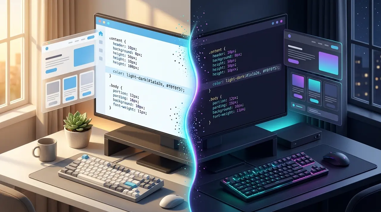
The CSS light-dark() function lets you set two color values in one declaration, one for light mode and one for dark, and the browser picks the right one automatically based on color-scheme. It replaces most prefers-color-scheme media query duplication for color values, cutting boilerplate without any JavaScript or extra custom properties.
What Problem Does This Actually Solve?
Before light-dark(), theming a site meant one of two patterns. Either you wrote a full duplicate rule set inside a @media (prefers-color-scheme: dark) block, or you defined custom properties at :root and reassigned them inside that same media query. Both work, but both scale badly. A design system with forty color tokens means forty duplicated declarations, and every new component adds to that duplication. Miss one override and you get a light-mode gray box in dark mode that nobody notices until a user reports it.
light-dark() collapses that into a single line per property:
1/* Old approach: duplicate blocks */2: root {3 --card-bg: #ffffff;4 --card-text: #111111;5}67@media (prefers-color-scheme: dark) {8 : root {9 --card-bg: #1a1a1a;10 --card-text: #eeeeee;11 }12}1314.card {15 background: var(--card-bg);16 color: var(--card-text);17}1/* New approach: one declaration, no media query duplication */2: root {3 color-scheme: light dark; /* required, see below */4}56.card {7 background: light-dark(#ffffff, #1a1a1a);8 color: light-dark(#111111, #eeeeee);9}The second version has no media query at all for this property. The browser evaluates light-dark() using the computed color-scheme value on the element (or an ancestor), which itself typically responds to prefers-color-scheme unless you override it manually with a toggle.
How Does the Browser Decide Which Value to Use?
light-dark() does not read prefers-color-scheme directly. It reads the color-scheme property's computed value on the element where the function is used. That distinction matters more than it looks.
color-scheme can be set to light, dark, light dark, only light, only dark, or normal. When you set light dark, you are telling the browser "this element supports both, pick based on user or system preference." If you never set color-scheme anywhere in your stylesheet, light-dark() will not switch, it just falls back to resolving as if color-scheme were light, per the CSS Color 5 specification. This is the single most common bug when people first try this function: they write background: light-dark(white, black) and wonder why dark mode never triggers. The fix is always the same, set color-scheme: light dark on :root or html.
1/* This alone is not enough */2.button {3 background: light-dark(#ffffff, #222222);4}56/* You also need this, usually once, at the root */7html {8 color-scheme: light dark;9}Because color-scheme is inherited and can be overridden per subtree, you can scope theme switching to a component. A widget embedded in a third-party page could declare its own color-scheme and its own light-dark() values independent of the host page's theme.
Manual Theme Toggles Without JavaScript Rewrites
A common requirement is a user-facing light/dark/system toggle that overrides the OS preference. With the media query approach, that toggle usually means adding a data-theme attribute and writing selector overrides for every themed rule, which reintroduces the duplication problem you were trying to avoid.
With light-dark(), the toggle only needs to change color-scheme, nothing else:
1/* Default: follow system preference */2html {3 color-scheme: light dark;4}56/* User explicitly picked light */7html[data-theme="light"] {8 color-scheme: light;9}1011/* User explicitly picked dark */12html[data-theme="dark"] {13 color-scheme: dark;14}1// Minimal toggle logic, no style recalculation needed beyond the attribute2function setTheme(mode) {3 // mode is "light", "dark", or "system"4 if (mode === "system") {5 document.documentElement.removeAttribute("data-theme");6 } else {7 document.documentElement.setAttribute("data-theme", mode);8 }9 localStorage.setItem("theme-preference", mode);10}1112// Restore saved preference on load13const saved = localStorage.getItem("theme-preference");14if (saved && saved !== "system") {15 document.documentElement.setAttribute("data-theme", saved);16}Every light-dark() call across your entire stylesheet responds correctly with zero additional selectors. You are not writing [data-theme="dark"] .card { ... } fifty times, you write it once for color-scheme and every color declaration downstream obeys it.
When Should You Still Use Custom Properties Instead?
light-dark() is not a full replacement for custom properties, and treating it as one causes problems in a few specific cases.
First, if you need more than two states (a brand theme, a high-contrast theme, a seasonal theme), light-dark() cannot help, it only ever accepts exactly two arguments. Custom properties with attribute selectors remain the right tool there.
Second, if you need to compute or transform the resolved color (feed it into color-mix(), adjust its alpha, or reuse it across multiple properties with logic), a custom property is easier to reason about than repeating the same light-dark() pair in five places. You can combine both: define a custom property using light-dark() once, then reference the variable everywhere.
1: root {2 color-scheme: light dark;3 --surface: light-dark(#ffffff, #121212);4 --surface-hover: light-dark(#f2f2f2, #1e1e1e);5}67.card {8 background: var(--surface);9}1011.card: hover {12 background: var(--surface-hover);13}Third, JavaScript cannot read a light-dark() value directly and get a resolved color back the way you might expect from getComputedStyle. It resolves at the CSS level, so if your app logic needs to know the actual active color in JS (for canvas rendering, chart libraries, or dynamically generated SVG), you still need to either read getComputedStyle on the actual element and let the browser resolve it there, or track the theme state separately in JS the way the toggle example above does.
Browser Support and the Gotchas That Bite
light-dark() shipped in Chrome 123 (March 2024), Firefox 120 (November 2023), and Safari 17.5 (May 2024). As of 2026 it is supported in every current stable release of major browsers, and it is safe to use as a primary technique for new projects, according to MDN's compatibility data. If you need to support older browser versions, whether from extended enterprise deployments or embedded WebViews, check current numbers on caniuse before committing, since embedded and locked-down browser environments lag behind desktop release cycles by months or years.
A few specific gotchas worth knowing before you ship this broadly:
light-dark() only accepts <color> values, not arbitrary tokens. You cannot use it for switching font sizes, spacing, or box-shadow shapes between modes, only actual color values (though you can nest it inside functions like color-mix() or use it as an argument to box-shadow's color portion).
If color-scheme is set on an element far up the tree and a component further down needs different behavior, remember that color-scheme inherits like most other properties, so a scoped override on a subtree works, but forgetting that inheritance exists is an easy way to get a surprising result in a design system with nested widgets.
Server-rendered pages with no-flash dark mode still need the classic inline script or color-scheme meta tag approach for the very first paint, because CSS alone cannot read localStorage. light-dark() solves the styling duplication problem, not the flash-of-wrong-theme problem, those are separate concerns and require separate solutions.
Testing It Properly Before You Ship
Do not just toggle your OS dark mode setting and call it done. Open DevTools and use the rendering panel (in Chrome and Edge, the "Rendering" tab has a "Emulate CSS media feature prefers-color-scheme" dropdown) to force light and dark independently of your OS, since this catches cases where your color-scheme override logic and the system preference disagree. Then check the three-state matrix explicitly: system-light, system-dark, and each manual override, confirming that switching the toggle at runtime updates every themed element without a page reload. Finally, grep your stylesheet for any remaining prefers-color-scheme media queries you meant to remove, since a leftover one can silently fight with a color-scheme override and produce a color that matches neither of your two light-dark() arguments.
Related Articles
Adapting UI components for Windows High Contrast mode using forced-colors
A styled checkbox that renders as a completely empty box is almost always a Windows contrast theme your CSS never accounted for. Here's how to detect that mode and restore visibility.
Enhancing Accessibility with prefers-contrast: Beyond Light and Dark Modes
Shipping a dark theme isn't the same thing as solving contrast accessibility for users with low vision. prefers-contrast composes with prefers-color-scheme instead of replacing it outright.
color-mix() and Relative Color Syntax: Dynamic Color Manipulation in CSS
Sass's lighten() and mix() compute once at build time and can't react to a CSS variable or a user's live theme choice. These functions run in the browser instead, on every repaint.