Enhancing Accessibility with prefers-contrast: Beyond Light and Dark Modes
Shipping a dark theme isn't the same thing as solving contrast accessibility for users with low vision. prefers-contrast composes with prefers-color-scheme instead of replacing it outright.
Paul Radford — Full-Stack Developer & Editor. Paul is a full-stack developer and editor of template.tips. Articles here are AI-drafted and reviewed by Paul, who knows the code well enough to catch what's wrong and cut the hype.
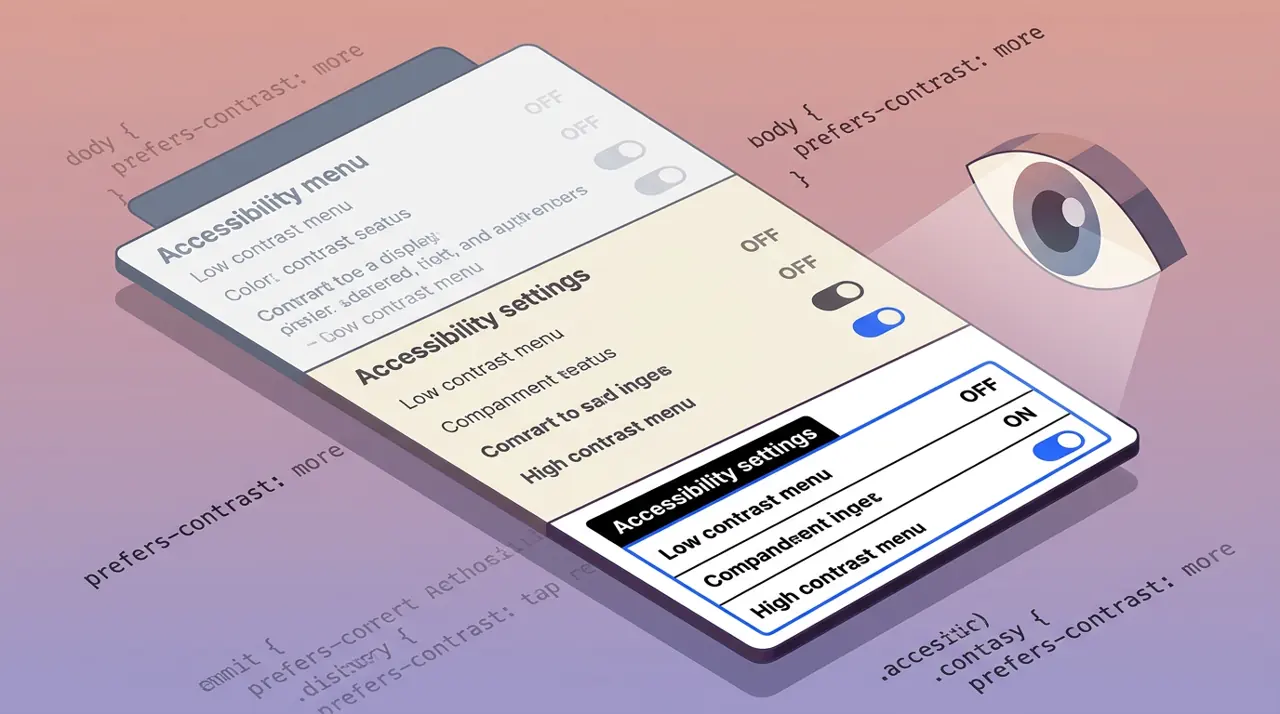
The prefers-contrast media feature lets you detect when a user has asked their operating system for more or less contrast between foreground and background colors, independent of light or dark mode. You use it to swap borders, thicken outlines, or replace subtle color cues with stronger ones, without forcing every visitor into a single high-contrast theme.
Most teams treat contrast accessibility as a color-mode problem: ship a dark theme, call it done. That conflates two separate user needs. Someone with low vision or a contrast-sensitivity condition (cataracts, some forms of dyslexia, certain migraine triggers) might want higher contrast in light mode, lower contrast in dark mode, or a completely different palette than either default theme provides. prefers-contrast gives you a hook for that axis directly, and it composes with prefers-color-scheme instead of replacing it.
What does prefers-contrast actually detect?
The media feature exposes four values: no-preference, more, less, and custom. The browser reads this from OS-level accessibility settings, for example Windows' "Contrast themes" panel or macOS's "Increase contrast" toggle under Accessibility > Display.
1/* Baseline card component */2.card {3 border: 1px solid #d0d0d0;4 background: #fafafa;5 color: #333;6}78/* User has requested more contrast at the OS level */9@media (prefers-contrast: more) {10 .card {11 border: 2px solid #000;12 background: #fff;13 color: #000;14 }15}1617/* User has requested less contrast (rare, but real) */18@media (prefers-contrast: less) {19 .card {20 border: 1px solid #999;21 background: #f0f0f0;22 color: #444;23 }24}The custom value matters more than it sounds. It fires when the OS reports that the user has an active custom contrast theme (Windows high-contrast themes like "Desert" or a user-authored one) rather than a simple binary toggle. When you get custom, you generally should not try to guess colors. Rely on system colors instead, which is the next section's problem.
One gotcha worth flagging early: prefers-contrast: more is not the same query as forced-colors: active. Windows high-contrast mode used to be detected primarily through -ms-high-contrast (a deprecated, Microsoft-only feature) and is now split across two modern queries that solve different problems. Confusing them leads to CSS that works on macOS but breaks, or silently does nothing, on Windows.
How is this different from forced-colors mode?
forced-colors: active means the browser itself is overriding your author colors with a limited system palette (this is what Windows high-contrast themes trigger in Chromium and Firefox). In forced-colors mode, most of your background and color declarations get ignored outright, and you're expected to use CSS system color keywords like Canvas, CanvasText, LinkText, and ButtonFace so the browser can still apply its override consistently.
prefers-contrast is different: it is a signal, not an override. Your author styles still apply. The browser is telling you "this user wants more contrast," and it is your job to deliver it. That means you can and should combine both queries, because they serve different situations.
1/* Default state: your normal design system */2.button {3 background: #4a7bd8;4 color: #fff;5 border: none;6}78/* Signal-based: user wants more contrast, but browser isn't forcing colors */9@media (prefers-contrast: more) {10 .button {11 background: #1a3a7a;12 color: #fff;13 border: 2px solid #000;14 }15}1617/* Override-based: Windows/browser is actively stripping your colors */18@media (forced-colors: active) {19 .button {20 background: ButtonFace;21 color: ButtonText;22 border: 1px solid ButtonText;23 }24}If you only handle forced-colors, you miss macOS and Linux users who toggle "increase contrast" but whose browser never enters a forced-colors state. If you only handle prefers-contrast, your component may look broken in an actual Windows high-contrast theme because the browser is stripping colors regardless of your media query. You need both, and they should not fight each other; keep the forced-colors block simple and let the browser's palette substitution do the heavy lifting there.
Practical patterns for more contrast
Increasing contrast is not just "make text darker." A few patterns hold up in real components:
Borders over shadows. Box-shadow-based affordances (subtle card elevation, soft focus rings) tend to disappear under contrast constraints because shadows rely on partial opacity blending with the background. Swap them for solid borders.
1.input-field {2 border: 1px solid #ccc;3 box-shadow: 0 1px 3px rgba(0, 0, 0, 0.1);4}56@media (prefers-contrast: more) {7 .input-field {8 border: 2px solid #000;9 box-shadow: none;10 }1112 .input-field: focus-visible {13 outline: 3px solid #000;14 outline-offset: 2px;15 }16}Icons need outlines, not just fill color changes. A muted gray icon on a white background might pass a 3:1 contrast check and still be functionally invisible to someone with low contrast sensitivity, since perceived contrast depends on more than the raw luminance ratio, including icon size and stroke width. Under prefers-contrast: more, consider swapping to a bolder icon variant rather than only recoloring the existing one.
Don't over-rely on the less value. Very few people request lower contrast, and the ones who do usually have light sensitivity (photophobia, certain migraine or autism-related sensory needs) rather than a desire for illegible text. Treat less as "soften harsh pure-black-on-pure-white contrast," not as license to drop below WCAG minimums. The WCAG 2.2 contrast minimum guidance still applies as a floor, prefers-contrast: less doesn't waive it.
Testing without owning every OS
You don't need a Windows machine, a Mac, and a Linux box on your desk to verify this. Chromium-based browsers (Chrome and Edge, from around version 96 onward) let you emulate the media feature directly in DevTools: open the Rendering tab, and use the "Emulate CSS media feature prefers-contrast" dropdown to cycle through more, less, custom, and no-preference without touching system settings. Firefox has supported the query since version 101 (released mid-2022) and you can toggle it live through the Inspector's rule view media-feature simulator in more recent versions, though the UI has moved around across releases, so check your installed version's Accessibility panel if the dropdown isn't where you expect.
For an actual OS-level check, macOS Ventura and later expose "Increase contrast" under System Settings > Accessibility > Display, and toggling it fires prefers-contrast: more in Safari 14.1+ as well as Chromium and Firefox on macOS. Windows contrast themes are a separate control from the simple "increase contrast" toggle Apple ships, and switching a Windows contrast theme on triggers forced-colors: active in addition to (or sometimes instead of, depending on the browser and OS build) prefers-contrast. Test both signals separately rather than assuming one implies the other.
As of early 2026, caniuse data for prefers-contrast shows support across all major evergreen browsers, but older Safari versions (pre-14.1) and any browser still running Chromium under version 96 will not recognize the query at all. Because it's a media query, unsupported browsers simply skip the block silently, no polyfill needed and no console warning either, which makes it low-risk to ship even if you're not sure of your full user base's browser mix.
Where this fits in a real component workflow
Treat prefers-contrast the same way you'd treat a breakpoint: define it once in your design tokens, not ad hoc per component. A practical setup uses CSS custom properties scoped inside the media query, so components just consume variables and never need their own @media block.
1: root {2 --border-color: #d0d0d0;3 --text-color: #333;4 --focus-ring: 2px solid #4a7bd8;5}67@media (prefers-contrast: more) {8 : root {9 --border-color: #000;10 --text-color: #000;11 --focus-ring: 3px solid #000;12 }13}1415.card,16.input-field,17.button-secondary {18 border-color: var(--border-color);19 color: var(--text-color);20}2122*: focus-visible {23 outline: var(--focus-ring);24}This keeps the contrast logic in one place, makes it trivial to audit (grep for --border-color usage instead of hunting through a dozen component stylesheets), and avoids the situation where three different developers implement three different interpretations of "more contrast" across a codebase. If you're building a design system, this token layer is the right place to own the decision, not the component layer.
Before shipping, run your highest-traffic flows (checkout, sign-up, primary navigation) through the DevTools emulation for all four values, then spot-check on real hardware if you have access to it. The MDN reference for prefers-contrast is worth bookmarking directly next to your component library docs, since the exact browser threshold for what counts as "more" versus "custom" is implementation-defined and has shifted slightly between browser versions. Don't treat this feature as a one-time addition either; revisit it whenever you introduce a new color-dependent affordance, because the easiest way for contrast support to rot is to add a new subtle-gray-on-white component six months later and forget the media query exists.
Related Articles
Adapting UI components for Windows High Contrast mode using forced-colors
A styled checkbox that renders as a completely empty box is almost always a Windows contrast theme your CSS never accounted for. Here's how to detect that mode and restore visibility.
light-dark(): The Simplest Way to Handle Color Mode Switching
Forty color tokens duplicated inside a prefers-color-scheme media query block is forty places to miss an override somewhere. light-dark() collapses that pattern into one line per property.
color-mix() and Relative Color Syntax: Dynamic Color Manipulation in CSS
Sass's lighten() and mix() compute once at build time and can't react to a CSS variable or a user's live theme choice. These functions run in the browser instead, on every repaint.