Adapting UI components for Windows High Contrast mode using forced-colors
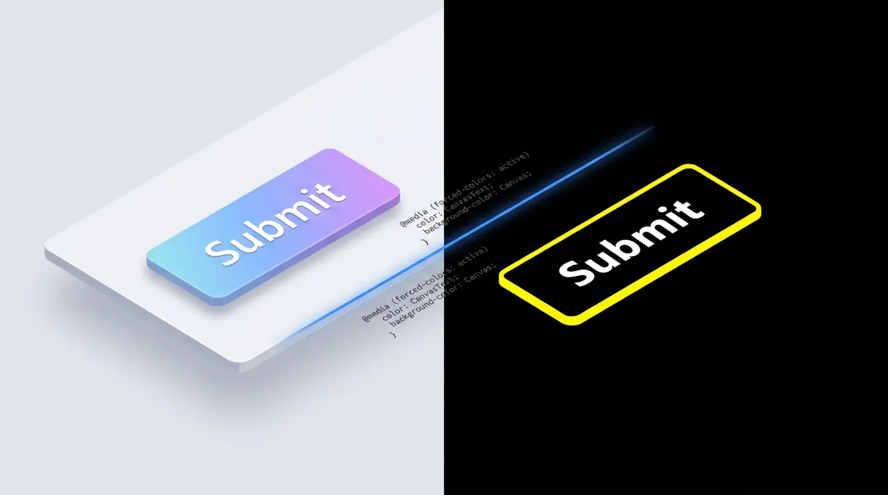
Windows High Contrast mode forces a user-defined color palette on web pages, often breaking custom UI components like styled checkboxes or buttons. The forced-colors media query allows developers to detect this mode and apply specific CSS to restore visibility.
Adapting UI components for Windows High Contrast mode using forced-colors
forced-colors: active is a CSS media feature that tells you the browser is currently overriding author-defined colors with a restricted, user-chosen palette, typically triggered by Windows High Contrast mode. Detecting it lets you rebuild broken components with system color keywords like CanvasText and Canvas, restoring visibility without fighting the accessibility feature itself.
If you maintain a component library long enough, you'll eventually get a bug report that says something like "your checkbox is just an empty box on my laptop." Nine times out of ten, the reporter has a Windows contrast theme turned on, and your CSS never accounted for a rendering mode that overrides most of the colors you specified.
What actually happens when forced-colors is active
Windows High Contrast mode (now called "Contrast themes" in Settings, under Accessibility) isn't a preference hint, it's an active rendering override. When a user enables it, the browser steps in and replaces most author-specified colors with a small set of values drawn from the palette the user picked in Windows: text color, background color, hyperlink color, and a couple of others. Chromium, Firefox, and Chromium-based Edge all implement this through the CSS Color Adjustment specification.
This is a meaningfully different mechanism from prefers-contrast: more, which just signals that the user wants more contrast and leaves your styles alone. With forced-colors: active, the browser has already started rewriting background-color, color, border-color, and often box-shadow before your stylesheet gets a vote. Flat background colors, gradients used decoratively, and custom border colors on many elements get flattened into the forced palette regardless of what you wrote.
The practical consequence: any component that signals state purely through background-color, like a checked checkbox, a selected tab, or a disabled button, can lose that signal entirely. The background gets forced to Canvas (the default page background color in the user's palette) and your intentional fill color disappears into it.
You detect the mode in CSS like this:
1@media (forced-colors: active) {2 /* Rules here only apply while the browser is actively3 overriding author colors, e.g. a Windows contrast theme */4}Support is solid across evergreen browsers: Chrome and Edge have supported forced-colors since version 89 (early 2021), and Firefox added it in the same version cycle. There's no need for prefixes or fallbacks on anything you'd ship in 2026. You can confirm current support details on caniuse if you're targeting older enterprise browser builds. Ignore the old -ms-high-contrast media feature entirely: it was specific to Edge Legacy and has no effect in Chromium-based Edge.
Why does a custom checkbox disappear in high contrast mode?
Here's a typical CSS-only checkbox, the kind built by visually hiding the native input and styling a sibling <span>:
1/* Base component, works fine under normal rendering */2.checkbox {3 position: relative;4 display: inline-flex;5 align-items: center;6 gap: 0.5em;7}89.checkbox input {10 position: absolute;11 opacity: 0;12 width: 1em;13 height: 1em;14}1516.checkbox .box {17 width: 1em;18 height: 1em;19 border: 2px solid #767676;20 border-radius: 3px;21 background-color: #ffffff;22}2324.checkbox input: checked + .box {25 background-color: #2563eb; /* blue fill signals "checked" */26 border-color: #2563eb;27}2829.checkbox input: checked + .box::after {30 content: ";";31 display: block;32 width: 0.5em;33 height: 0.5em;34 margin: auto;35 background-color: #ffffff; /* the checkmark, punched out of the fill */36}Under a forced-colors theme, the browser typically overrides background-color on .box and .box::after to the same forced value, often Canvas, and it forces the border toward CanvasText regardless of checked state. The blue fill vanishes. The white checkmark, now sitting on the same background it was designed to contrast against, blends in completely. You end up with an empty square. The input underneath still works, a screen reader still announces "checked," but sighted users relying on the visual state get nothing. That gap between functional correctness and visual communication is exactly what generates the support ticket.
How do you fix it with CanvasText and Window?
The fix isn't to force your brand colors back onto the page. That defeats the reason the mode exists and can actually produce worse contrast than the user's chosen theme. Instead, rebuild the checked and unchecked states using CSS system color keywords, which the browser guarantees are legible against each other no matter what palette the user picked.
The two keywords you'll reach for constantly:
- CanvasText: the user's chosen foreground/text color.
- Canvas: the user's chosen page background color (this replaced the older Window keyword, which is still supported as an alias in most engines but is considered legacy).
1/* Forced-colors fix: layered on top of the base rules above,2 scoped so it only fires when the browser is overriding colors */3@media (forced-colors: active) {4 .checkbox .box {5 /* Let the forced background win, just guarantee a visible border */6 background-color: Canvas;7 border-color: CanvasText;8 }910 .checkbox input: checked + .box {11 /* Fill with the foreground color so "checked" reads as a12 solid block against the page background */13 background-color: CanvasText;14 border-color: CanvasText;15 }1617 .checkbox input: checked + .box::after {18 /* Punch the checkmark out using the background color,19 so it's visible against the CanvasText fill */20 background-color: Canvas;21 }2223 /* Focus rings also get flattened in this mode; rebuild24 them explicitly using the Highlight system color */25 .checkbox input: focus-visible + .box {26 outline: 2px solid Highlight;27 outline-offset: 2px;28 }29}This works because CanvasText and Canvas are contrast-guaranteed against each other by the browser, by definition, since they're literally the foreground and background the user selected. If someone picked yellow text on black, the checked box fills yellow and the checkmark punches through as black. It won't look anything like your branded blue checkbox, and that's the correct outcome: the goal here is legibility, not brand consistency.
Highlight is worth calling out separately from CanvasText. It maps to the system's selection or accent color and reads as visually distinct from the plain foreground color in most themes, which makes it a better fit for focus indicators than reusing CanvasText again. The full list of system color keywords, including LinkText, ButtonFace, and GrayText, is documented on MDN's system colors reference.
When should you avoid fighting forced-colors instead of embracing it?
There's a property, forced-color-adjust: none, that tells the browser to leave your colors alone inside a given subtree. It's tempting to reach for it everywhere your design "breaks," but that's the wrong instinct. It's appropriate for a narrow set of cases where the color itself is the information: a color picker swatch, a rendered logo, a status dot where hue (red, amber, green) is the actual signal being conveyed. It is not appropriate as a blanket opt-out for "my component looks worse in high contrast," because that just reintroduces the exact failures the user turned the mode on to avoid.
1/* Use forced-color-adjust sparingly, and always pair it2 with a non-color signal as a fallback */3.status-dot[data-status="error"] {4 background-color: #dc2626;5}67.status-dot: :after {8 content: attr(data-status); /* text label backs up the color */9}1011@media (forced-colors: active) {12 .status-dot {13 forced-color-adjust: none;14 }15}One real gotcha worth testing directly: forced-color-adjust doesn't have the same support history as the forced-colors media query itself. Firefox added the media query in version 89 but didn't ship the forced-color-adjust property until version 96 (late 2021). If you're supporting Firefox ESR builds from that window, or older enterprise Chromium deployments, your opt-out can silently do nothing while the media query still fires. Check current support on MDN's forced-color-adjust page before relying on it as your only safeguard.
A second edge case that catches people: focus and hover states built with box-shadow rather than outline or border often disappear completely, because box-shadow gets forced to none in some engines under this mode. If your interactive states depend on shadow alone, rebuild them with a real outline inside your forced-colors: active block. Outlines are respected consistently and pick up Highlight or CanvasText predictably.
For testing without a Windows machine handy, Chromium and Firefox DevTools both support emulating the mode. In Chrome, open DevTools, run the command palette (Ctrl/Cmd+Shift+P), search "Rendering," and enable "Emulate CSS media feature forced-colors." It catches the obvious failures, invisible checkboxes, vanished focus rings, but it doesn't perfectly replicate every color mapping quirk of a real Windows contrast theme, so verify final builds on actual hardware before calling a fix done.
Key Takeaways
- forced-colors: active has been supported in Chrome and Edge since version 89 and in Firefox since the same 2021 release cycle; no prefixes or polyfills are needed for modern targets, per MDN's forced-colors documentation.
- CanvasText and Canvas are the core system color pair for rebuilding foreground and background: the browser guarantees they're legible against each other in whatever palette the user selected.
- forced-color-adjust: none should be scoped narrowly, to elements where hue itself is the information, and always paired with a text or icon fallback, since Firefox only added property support in version 96 while the media query has existed since 89.
- Interactive states built with box-shadow are at risk of vanishing entirely under forced colors; rebuild them with outline and the Highlight keyword instead.
- Chrome DevTools' Rendering tab can emulate the mode for fast iteration, but it doesn't replace testing on a real Windows contrast theme before shipping.
Related Articles

Serving responsive background images with the CSS image-set function
While the HTML <picture> element handles responsive inline images, CSS background images have historically required complex media queries. The image-set() function allows the browser to automatically select the most appropriate background image based on screen resolution and format support.

Removing wrapper nodes from CSS Grid and Flexbox with display: contents
The display: contents property allows an element to visually disappear while its children participate directly in the parent's Grid or Flexbox layout. This article breaks down how it works, when to use it for semantic HTML, and the historical accessibility bugs you need to know.