The dialog Element: Native Modals Without JavaScript
The dialog Element: Native Modals Without JavaScript

The <dialog> element gives you a built-in modal or non-modal window with focus trapping, a top-layer rendering context, and a ::backdrop pseudo-element, all handled by the browser. You still need a small amount of JavaScript to open it (showModal()), but you no longer need to hand-roll focus management, ARIA wiring, or z-index stacking.
What Problem Is dialog Actually Solving?
Before this element shipped widely, "modal" meant a div with position: fixed, a manually managed aria-modal="true", a focus trap built from keydown listeners, and a z-index war with every other overlay on the page. Libraries like Radix, Headless UI, and jQuery UI existed largely to paper over that missing platform primitive.
<dialog> does not replace all of that tooling, but it removes the parts that were hardest to get right:
- Focus moves into the dialog automatically when opened with showModal(), and returns to the triggering element when closed.
- Content outside an open modal dialog becomes inert: it cannot be tabbed into or clicked, without you writing any inert-management code.
- The browser renders the dialog in the top layer, so it sits above everything else in the document regardless of stacking contexts, the same mechanism used by the popover API and fullscreen elements.
- Escape closes a modal dialog by default, firing a cancel event you can intercept.
What it does not give you: animated open/close transitions out of the box (though @starting-style and the new discrete-property transition behavior make this workable), a built-in way to dismiss on backdrop click, or scroll locking on the body in every browser without a nudge.
Basic Usage: Modal vs Non-Modal
The distinction between show() and showModal() is the first thing developers get wrong.
1<!-- Non-modal: no backdrop, no focus trap, no inert background -->2<dialog id="tooltip-dialog">3 <p>This behaves like a popover, not a modal.</p>4 <button onclick="this.closest('dialog').close()">Close</button>5</dialog>67<!-- Modal: backdrop, focus trap, background becomes inert -->8<dialog id="confirm-dialog">9 <form method="dialog">10 <p>Delete this item?</p>11 <button value="cancel">Cancel</button>12 <button value="confirm">Delete</button>13 </form>14</dialog>1// show() opens a non-modal dialog: it does not get a backdrop,2// does not trap focus, and does not make the rest of the page inert.3document.getElementById('tooltip-dialog').show();45// showModal() opens it as a true modal: backdrop appears,6// focus moves inside, background content becomes inert.7const confirmDialog = document.getElementById('confirm-dialog');8confirmDialog.showModal();910// The dialog's returnValue is set from the button's "value" attribute11// when a <form method="dialog"> submits inside it, no JS click handler needed.12confirmDialog.addEventListener('close', () => {13 console.log('User chose:', confirmDialog.returnValue);14});The method="dialog" form trick is easy to miss in tutorials but it is what lets you close a dialog and capture which button was pressed with zero JavaScript beyond an event listener. See the WHATWG HTML spec on the dialog element for the full state machine behind open, modal, and closed states.
How Do You Close a Dialog by Clicking Outside It?
This is the single most common feature request, and it is not automatic. The backdrop is a real pseudo-element you can target, and clicks on it bubble to the dialog itself (since the backdrop is not a separate DOM node you can attach a listener to directly), so the standard pattern checks whether the click target is the dialog element itself rather than something nested inside it.
1// Clicking directly on the dialog element (which visually corresponds2// to clicking the backdrop, since the dialog fills its content box)3// closes it. Clicking on a child element does not, because that click's4// target will be the child, not the dialog.5const dialog = document.querySelector('dialog');67dialog.addEventListener('click', (event) => {8 if (event.target === dialog) {9 dialog.close();10 }11});1/* Style the backdrop directly, no extra markup required */2dialog: :backdrop {3 background: rgb(0 0 0 / 0.5);4 backdrop-filter: blur(2px);5}67/* Common gotcha: dialog has a default max-width/max-height8 and centers itself via the UA stylesheet's positioning rules.9 Overriding "display" or "position" incorrectly can break10 the top-layer centering, so adjust width/margin instead. */11dialog {12 width: min(90vw, 480px);13 padding: 1.5rem;14 border: none;15 border-radius: 0.5rem;16}If you want animated entry and exit, you need @starting-style plus a transition on opacity and display, because display: none cannot normally be transitioned. Chrome 117+ and recent Firefox support this; check current status on caniuse for the dialog element before relying on it for a production audience that includes older browsers.
Where This Breaks Down: Real Gotchas
Nested dialogs and stacking order. The top layer renders in the order dialogs were opened, so a second showModal() call while one is already open will stack correctly, but closing the bottom one first while the top one is still open leaves you in an odd state where the "modal" background is no longer inert relative to the remaining open dialog. Test this explicitly if you support stacked modals like a confirm-inside-a-form pattern.
Scroll locking is not guaranteed. Some browsers still allow scrolling the underlying page with a mouse wheel or via a scrollable container inside the dialog interacting oddly with overflow on body. In practice you often still need body { overflow: hidden } toggled on open, which is the one piece of "modal plumbing" <dialog> did not fully solve.
Autofocus behavior differs across browsers. By spec, showModal() focuses the first focusable element, or the dialog itself if nothing inside is focusable. Older Safari versions (pre-15.4) had <dialog> unsupported entirely, and even after support landed, some autofocus edge cases with autofocus attribute placement inside nested forms behaved inconsistently through Safari 16. If you support Safari versions from before March 2022, <dialog> will not exist at all and you need a polyfill or feature detection fallback.
Screen reader announcement is inconsistent for non-modal dialogs opened with show(). Because non-modal dialogs do not get aria-modal, some screen readers do not announce the dialog opening at all unless you add role="alert" or manage focus yourself. Do not assume show() gives you accessible behavior equivalent to showModal(), it deliberately does not.
Forms inside dialogs and implicit submission. A <form> without method="dialog" inside a dialog submits normally and can navigate away or trigger a full page reload if you are not intercepting it, which surprises developers who assumed all forms inside a dialog behave like the close-button pattern.
When Not to Reach for dialog
Skip it for simple tooltips, comboboxes, or menu popovers where the newer Popover API is a better fit: lighter weight, no forced backdrop, and designed specifically for lightweight transient UI rather than blocking interaction. Skip it also if you need fine control over focus order that differs from DOM order, since the automatic focus trap follows document order and fighting that with manual tabindex juggling defeats the purpose of using the native element.
If your app already depends on a mature modal library with tested accessibility behavior across a matrix of assistive technologies you have already validated, swapping to native <dialog> purely for the sake of "using the platform" is not automatically a win. The native element is genuinely good, but library-based solutions that have been audited against JAWS, NVDA, and VoiceOver for years may still outperform a naive native implementation you haven't tested yourself.
Testing Your Implementation
Do not ship a dialog without manually checking these three things, because automated accessibility linters will not catch most of them:
- Tab through the open modal with a keyboard only, and confirm focus never lands on anything outside it. Then press Escape and confirm focus returns to the element that opened it, not to the top of the page.
- Open the dialog with VoiceOver (Mac) or NVDA (Windows) running and confirm it announces as a dialog with a readable label. If it just says "web dialog" with no name, add an aria-label or reference a heading inside it with aria-labelledby.
- Resize the viewport to a small mobile width and confirm the dialog's default max dimensions and your own width overrides do not clip content or push buttons off screen, since the UA stylesheet's centering behavior can interact unpredictably with very small viewports.
Run those three checks against real browsers, not just DevTools emulation, before you consider a dialog-based modal done. The element removes most of the boilerplate, but it does not remove the responsibility of verifying the result actually works for someone who isn't you.
Related Articles
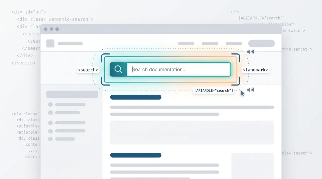
When and how to use the HTML search element
The HTML <search> element provides a semantic landmark for search and filtering interfaces without requiring ARIA roles. This article covers the exact criteria for when to use <search> versus a standard <form>, and how it impacts screen reader navigation.
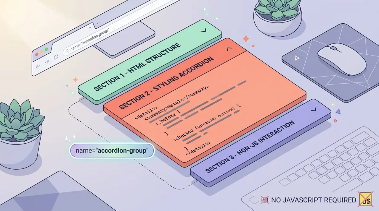
Building exclusive accordions natively with the HTML details name attribute
Developers have historically relied on JavaScript to create exclusive accordions where opening one panel closes the others. The new name attribute on the HTML details element solves this natively, allowing browsers to handle the state management.