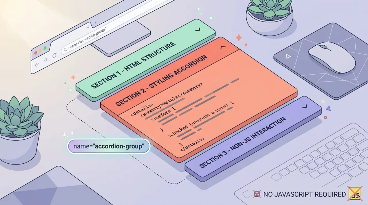
Building exclusive accordions natively with the HTML details name attribute
Developers have historically relied on JavaScript to create exclusive accordions where opening one panel closes the others. The new name attribute on the HTML details element solves this natively, allowing browsers to handle the state management.
Building exclusive accordions natively with the HTML details name attribute
The name attribute on <details> lets you group multiple elements so that opening one automatically closes the others, giving you a native exclusive accordion with zero JavaScript. Browsers manage the state internally, the same way radio buttons manage selection within a form, which removes an entire category of bugs developers used to write by hand.
For years, "accordion" meant reaching for a JavaScript library or writing your own click handlers to track which panel was open and force-close the rest. That's no longer necessary for the common case. This article shows how the name attribute works, how to style the open and closed states properly, how to get smooth height animations with ::details-content, and where this pattern is a poor fit despite being technically available.
How does the details name attribute create exclusive groups?
Give two or more <details> elements the same name value and the browser treats them as a set, like radio inputs sharing a name. Opening one closes any other open member of the group automatically. No onclick, no state array, no manual open attribute toggling.
1<!-- All three share name="faq", so only one can be open at a time -->2<details name="faq">3 <summary>What payment methods do you accept?</summary>4 <p>We accept all major credit cards, PayPal, and bank transfers.</p>5</details>67<details name="faq">8 <summary>How long does shipping take?</summary>9 <p>Standard shipping takes 3-5 business days within the continental US.</p>10</details>1112<details name="faq">13 <summary>Can I return an item?</summary>14 <p>Yes, items can be returned within 30 days of purchase for a full refund.</p>15</details>That's the entire mechanism. No JavaScript file, no ARIA state management, no event listeners. The browser handles focus and toggling internally, and it fires the usual toggle event on each element if you need to hook into the change for analytics or lazy-loading content.
One practical gotcha: if you mark more than one grouped <details> as open in the initial HTML, browsers resolve the conflict by respecting only the last one in document order (this matches how radio button groups behave with multiple checked attributes). Don't rely on that resolution order intentionally, just make sure your markup only has one open attribute per group to begin with.
Browser support is solid. The name attribute on <details> shipped in Chrome 120 (December 2023), Firefox 125, and Safari 17.4. If you need to support anything older, exclusive grouping silently degrades to independent, non-exclusive accordions rather than throwing an error, which is a reasonably safe fallback. Check the current numbers on MDN's details element reference before shipping if your analytics show a meaningful chunk of older Safari or Firefox traffic.
How do you style open and closed states without a class toggle?
You don't need a JavaScript-added class like .is-open anymore. The [open] attribute selector and the ::details-content pseudo-element cover styling and animation respectively.
1/* Base panel styling */2details {3 border: 1px solid #ddd;4 border-radius: 8px;5 margin-bottom: 0.5rem;6 overflow: hidden;7}89summary {10 padding: 1rem;11 cursor: pointer;12 font-weight: 600;13 list-style: none; /* remove default triangle marker */14 display: flex;15 justify-content: space-between;16 align-items: center;17}1819/* Custom disclosure indicator that rotates on open */20summary: :after {21 content: ";+";22 font-size: 1.25rem;23 transition: transform 0.2s ease;24}2526details[open] summary: :after {27 content: ";-";28}2930/* Visually distinguish the active panel's header */31details[open] summary {32 background-color: #f0f4ff;33 color: #1a3d8f;34}The [open] attribute selector is the key. It reflects the current state directly in CSS, no class-list manipulation required. Pair it with summary::marker if you want to keep the native triangle but just recolor or resize it, though most designers end up hiding the marker (list-style: none or summary::marker { content: ""; } on Firefox) in favor of a custom indicator like the plus/minus above.
How do you animate details opening with ::details-content?
This is where the older <details> implementation frustrated people. Before ::details-content, the element's content had display: none internally when closed, and display can't be animated with a CSS transition. Developers resorted to measuring scrollHeight in JavaScript and animating max-height, which is fragile with dynamic content.
::details-content is a pseudo-element representing the expandable content box (everything except the <summary>). Browsers now use content-visibility internally rather than display: none, which means the content box itself is transition-capable. You can animate block-size (or height), opacity, and even content-visibility cleanly.
1/* Style the collapsible region */2details: :details-content {3 padding: 0 1rem;4 opacity: 0;5 overflow: hidden;6 transition:7 content-visibility 0.3s allow-discrete,8 opacity 0.3s ease,9 block-size 0.3s ease,10 padding 0.3s ease;11 block-size: 0;12}1314details[open]: :details-content {15 opacity: 1;16 block-size: auto;17 padding: 1rem;18}1920/* Respect users who don't want motion */21@media (prefers-reduced-motion: reduce) {22 details: :details-content {23 transition: none;24 }25}A couple of things worth knowing before you copy this in verbatim. First, allow-discrete is required to transition content-visibility at all, since it's normally a discrete property that jumps between values instead of interpolating. Second, animating to block-size: auto works in current Chrome and Firefox because they've added support for interpolating to auto sizes for exactly this use case, but it's a newer capability than the name attribute itself. If you test in an older engine and the transition just snaps instead of animating smoothly, that's the likely cause. Google's own writeup on this pattern in the Chrome for Developers exclusive accordion guide walks through the same mechanism if you want a second reference while debugging support quirks.
Always include the prefers-reduced-motion block. Accordions that slam open with no animation are fine; the failure mode you want to avoid is a broken half-animation for users who've explicitly asked for reduced motion at the OS level.
Is an exclusive accordion actually good for accessibility?
This is the part people skip, and it's the part that actually matters most.
The accessibility argument against exclusive accordions goes like this: forcing panels closed removes content the user may have wanted to keep visible, for example if they're comparing answers across two FAQ entries, or if a screen reader user has built a mental map of the page and now finds content unexpectedly gone. The WAI-ARIA Authoring Practices historically describe accordions as optionally exclusive, not mandatorily so, leaving the choice to the implementer based on content needs.
Native <details> already has solid accessibility groundwork underneath it: <summary> is exposed as a button with the correct expanded/collapsed state, keyboard interaction (Enter and Space to toggle, Tab to move between panels) works without you writing any ARIA, and screen readers announce state changes automatically. That's a real win over the historical practice of hand-rolling <div role="button"> with manual aria-expanded bookkeeping, where it was easy to forget an attribute update and desync the visual state from what assistive tech announces.
Where you need to make a judgment call is whether exclusivity itself is the right UX for your content:
- Use exclusive grouping (name attribute) for genuinely mutually exclusive content, like a set of FAQ items where showing one answer per question at a time reduces visual clutter and matches how users actually read FAQs.
- Skip exclusivity for content where users plausibly want multiple panels open simultaneously, like a settings page with independent sections or documentation where someone's comparing two code examples side by side. In that case, just use <details> without the shared name.
- Never use exclusive accordions to hide content that's actually required reading, like terms of service or safety warnings. Collapsing that content by default, exclusive or not, creates a discoverability problem regardless of the accessibility of the toggle mechanism itself.
There's also a subtler edge case: if you deep-link to a specific <details> panel via a URL fragment, browsers automatically open it (this has worked since <details> shipped, independent of the name attribute). But if that panel is part of an exclusive group, opening it via fragment navigation will close whatever was previously open, which can be surprising if a user arrives from a shared link expecting a blank slate and finds a different panel was open a moment ago. It's a minor issue, but worth testing if your accordion is linkable.
When should you avoid this pattern entirely
Native exclusive accordions aren't a universal replacement for every JS accordion library. A few real limitations:
Complex animation requirements (staggered content reveal, custom easing curves synced to icon animations, height calculations that depend on responsive breakpoints) are still easier to achieve with a JS-driven approach where you have full control over the render cycle. The native CSS approach above covers the 80% case cleanly but doesn't give you hooks for anything more elaborate without still writing some JavaScript to listen for the toggle event.
If you need server-rendered state that persists across page loads (remembering which FAQ item a user last opened), you still need JavaScript or a backend to read and write that preference. <details open> only controls initial render state in the HTML you ship.
And if your project needs to support browsers before the 2023-2024 window mentioned earlier as a hard requirement (some enterprise intranet environments still mandate older Edge or Safari versions), test the fallback behavior explicitly rather than assuming graceful degradation looks acceptable. Non-exclusive behavior might be fine, or it might look broken next to a mockup that assumed exclusivity.
Key Takeaways
- The name attribute groups <details> elements like radio button name groups; opening one closes the others with no JavaScript, and it shipped in Chrome 120, Firefox 125, and Safari 17.4.
- ::details-content replaced the old display: none internal behavior, making smooth height and opacity transitions possible; use content-visibility: hidden with the allow-discrete transition keyword to animate it correctly.
- Always wrap your accordion transitions in a prefers-reduced-motion: reduce media query fallback that disables the transition entirely.
- Exclusive accordions aren't automatically more or less accessible than non-exclusive ones. The choice depends on whether your content is genuinely mutually exclusive; <summary> already handles keyboard access and ARIA state for you either way.
- Deep-linking into a panel that belongs to an exclusive group will close any other open panel in that group, which can surprise users arriving from a shared link.
Related Articles
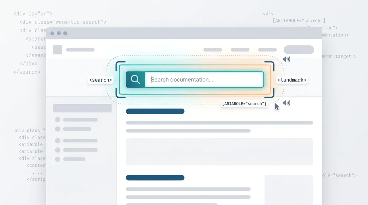
When and how to use the HTML search element
The HTML <search> element provides a semantic landmark for search and filtering interfaces without requiring ARIA roles. This article covers the exact criteria for when to use <search> versus a standard <form>, and how it impacts screen reader navigation.
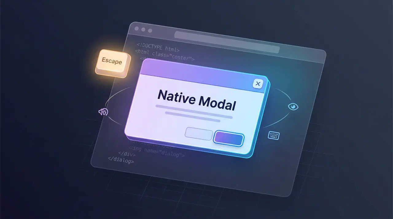
The dialog Element: Native Modals Without JavaScript
The dialog Element: Native Modals Without JavaScript