Native Popovers Without JavaScript: The Popover API in Depth
Native Popovers Without JavaScript: The Popover API in Depth
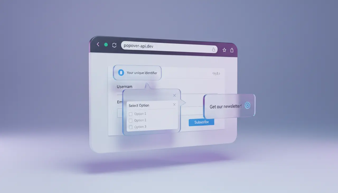
The Popover API lets you build dismissible overlays, tooltips, menus, and dropdowns using only HTML attributes and CSS, with the browser handling focus management, light-dismiss (click-outside-to-close), Escape key handling, and top-layer rendering. You still need JavaScript for anything beyond basic show/hide, but the days of hand-rolling a focus trap for a simple info bubble are over.
What Problem Does This Actually Solve?
Before this API shipped, every popover, dropdown, and toast notification required a pile of boilerplate: a click listener to open it, another to detect clicks outside the element, a keydown listener for Escape, manual aria-expanded toggling, and z-index wrangling to make sure the thing actually appeared above everything else on the page. Libraries like Popper.js, Floating UI, and countless homegrown solutions existed largely to paper over this gap.
The popover attribute moves that logic into the browser itself. When you mark an element with popover, it gets removed from the normal DOM flow and rendered in the top layer, the same rendering layer used by the native <dialog> element and fullscreen video. That means no more fighting stacking contexts inside a component with overflow: hidden on a parent.
Basic Syntax: The Minimum You Need
The simplest working popover needs two things: the popover attribute on the element you want to show, and a popovertarget attribute on the button that controls it.
1<!-- The button's popovertarget value must match the popover element's id -->2<button popovertarget="info-popover">More info</button>34<div id="info-popover" popover>5 <p>This is a native popover. Click outside or press Escape to close it.</p>6</div>That is a complete, working implementation. No script tag, no event listeners, no ARIA attributes you have to remember to add. The browser automatically wires up the button as the invoker, sets aria-expanded and aria-details where appropriate, and treats an outside click or Escape press as a close signal.
Auto vs Manual: Which Popover Type Do You Actually Need?
The popover attribute takes a value, and the value you choose changes behavior significantly. This trips people up constantly because the default behaves differently from what many developers expect coming from custom dropdown implementations.
popover="auto" (the default if you just write popover) gives you light-dismiss behavior and, crucially, auto-closes any other auto popover that's currently open when a new one is triggered. This is what you want for menus, comboboxes, and tooltips, cases where only one should reasonably be open at a time.
popover="manual" disables light-dismiss entirely. Clicking outside does nothing. You have to close it programmatically or via another popovertarget button with popovertargetaction="hide". Use this for things like a persistent notification tray or a multi-step widget where an accidental outside click shouldn't nuke the user's progress.
1<!-- Manual popovers ignore outside clicks and Escape by default in most cases -->2<button popovertarget="cart-tray" popovertargetaction="show">Open cart</button>3<button popovertarget="cart-tray" popovertargetaction="hide">Close cart</button>45<div id="cart-tray" popover="manual">6 <p>Your cart contents persist until explicitly dismissed.</p>7</div>Getting this choice wrong is the single most common bug I see in early adoptions. Teams default to manual because it feels "safer" and then wonder why they've had to reimplement light-dismiss in JavaScript anyway, defeating the entire point of switching to the native API.
Styling the Top Layer and the Backdrop
Because popovers render in the top layer, normal parent-relative positioning doesn't apply the way you'd expect from position: absolute. You position a popover the same way you'd position a <dialog>: usually with position: fixed or by using the CSS Anchor Positioning API to tie it to its invoker.
1/* Basic styling for an auto popover, including entry/exit transitions */2[popover] {3 border: 1px solid #ccc;4 border-radius: 8px;5 padding: 1rem;6 box-shadow: 0 4px 12px rgba(0, 0, 0, 0.15);7 /* transition-behavior: allow-discrete lets you animate display changes */8 transition: opacity 0.2s ease, display 0.2s allow-discrete;9 opacity: 0;10}1112[popover]: popover-open {13 opacity: 1;14}1516/* : :backdrop only applies to popovers rendered via showPopover, matching dialog behavior */17[popover]: :backdrop {18 background: rgba(0, 0, 0, 0.25);19}Note that ::backdrop on a plain popover is often invisible by default and many developers expect a dimmed background like <dialog> gives them for free; you have to style it explicitly if you want it. Also note the :popover-open pseudo-class, which is the hook you use for entry and exit animations, paired with transition-behavior: allow-discrete so that display: none doesn't just snap instantly and skip your transition.
When Should You Reach for the JavaScript API Instead of Attributes?
Declarative attributes cover triggering and dismissal, but plenty of real interfaces need programmatic control: opening a popover in response to a fetch resolving, closing one after a form validates, or coordinating two popovers that aren't simple siblings in the DOM.
1// Grab the popover element directly and control it imperatively2const popover = document.getElementById('info-popover');34// Show it in response to some non-click condition5fetch('/api/status')6 .then((res) => res.json())7 .then((data) => {8 if (data.hasWarning) {9 popover.showPopover();10 }11 });1213// Listen for the toggle event to react to state changes14popover.addEventListener('toggle', (event) => {15 console.log(event.newState); // "open" or "closed"16});The toggle event (and the newer beforetoggle event, useful for canceling an open) is what you reach for when you need to sync popover state with something else in your application, like closing a search overlay when the user starts navigating, or logging analytics when a tooltip is dismissed.
Where This Breaks: Nesting, Focus, and Accessibility Gotchas
The API is solid but not magic, and a few sharp edges matter in production.
Nested popovers work, but only if the nested popover is a DOM descendant of the one that triggers it, or if you explicitly wire it up. If your markup structure doesn't reflect the visual nesting (common in component libraries that render popovers into a portal at the end of <body>), auto-close behavior can misfire, closing a parent popover when you only meant to interact with a child.
Focus is not automatically moved into the popover on open. Unlike <dialog> opened with showModal(), which traps and moves focus, a plain popover leaves initial focus wherever it was. For anything acting like a menu, you generally want to add autofocus to the first interactive element inside the popover, or manage focus yourself in a toggle event handler.
Browser support is good but not universal in every context as of early 2026. The API shipped in Chrome 114 (May 2023), reached Safari 17 (September 2023), and landed in Firefox 125 (April 2024), so all major evergreen browsers now support it. Anchor positioning, which pairs naturally with popovers for tooltip-style placement, has narrower support and shipped later in Chrome than the core popover attribute did, so check caniuse before relying on it for layout rather than just using position: fixed with manual coordinates as a fallback. Also worth checking directly: the MDN Popover API guide and the WHATWG HTML spec section on popover both call out edge cases around form association and implicit anchor elements that are easy to miss on a first read.
If you need strict modality (background genuinely inert, focus locked, no dismissal except through your own logic), <dialog> with showModal() is still the correct tool, not popover. Popover is for transient, dismissible UI. Trying to force modal behavior onto a popover means reimplementing everything the API was supposed to save you from.
A Practical Way to Verify Your Implementation
Before shipping a popover-based component, run it through a short manual checklist rather than trusting that "it opens and closes" means it's done. Tab to the trigger button using only the keyboard and confirm the popover opens with Enter or Space. Press Escape and confirm focus returns to the trigger, not to the top of the page. Open the popover, then click a link or button inside a sibling popover that's set to auto, and confirm the first one closes as expected rather than stacking awkwardly.
Then turn on a screen reader (VoiceOver on Safari is a reasonable baseline, since Safari's popover support is comparatively recent) and confirm the trigger announces its expanded state. If any of that fails, the fix is almost always in how you're managing focus or which popover type you chose, not a browser bug. In my experience, the type mismatch between auto and manual accounts for the majority of "broken" popover reports once you actually dig into a ticket.
Related Articles
When and how to use the HTML search element
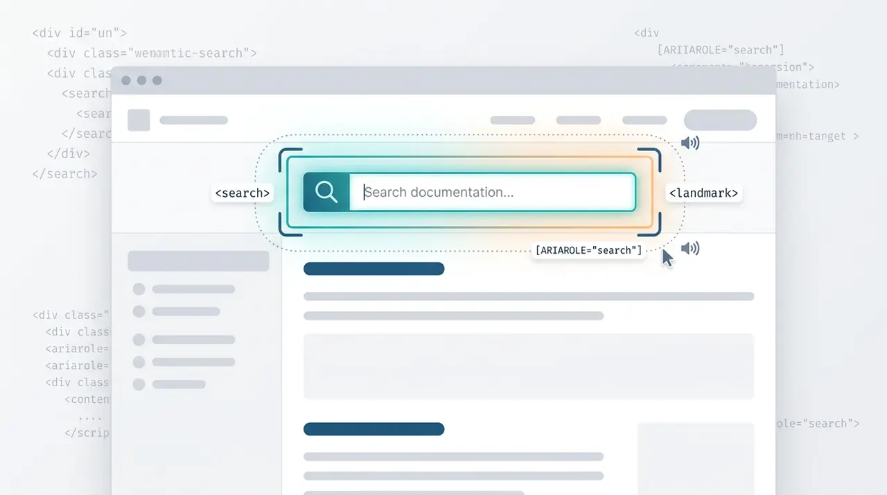
The HTML <search> element provides a semantic landmark for search and filtering interfaces without requiring ARIA roles. This article covers the exact criteria for when to use <search> versus a standard <form>, and how it impacts screen reader navigation.
Building exclusive accordions natively with the HTML details name attribute
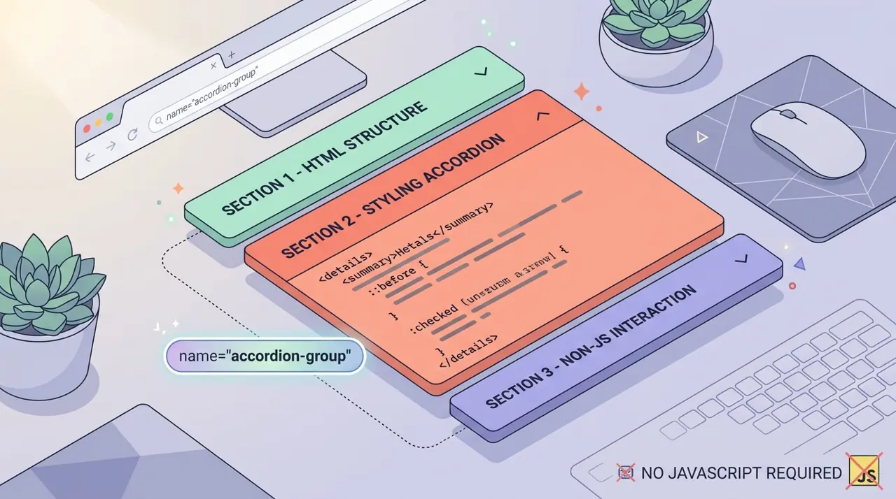
Developers have historically relied on JavaScript to create exclusive accordions where opening one panel closes the others. The new name attribute on the HTML details element solves this natively, allowing browsers to handle the state management.