Modern HTML Accessibility: Beyond the Basics in 2026
Modern HTML Accessibility: Beyond the Basics in 2026

Modern HTML accessibility in 2026 means going past alt text and heading order into interactive semantics: managing focus for dynamic regions, using the Accessibility Object Model (AOM) correctly, handling inert and popover, and testing with actual assistive tech rather than automated linters alone. The basics still matter, but they no longer cover what real applications need.
Most teams I work with have the fundamentals down. Alt text exists, headings mostly nest correctly, forms have labels. What breaks accessibility in production apps now is almost always dynamic behavior: content that appears without a focus change, custom widgets that fight the browser's own semantics, or third-party scripts that inject markup nobody audited. This article covers the parts of the spec and platform that actually cause support tickets and lawsuits in 2026, not the parts that show up in checklists.
Is aria-hidden still necessary when you have inert?
Short answer: yes, but they solve different problems and mixing them up creates bugs.
inert removes an element and its subtree from the tab order, from aria-hidden-style exposure to assistive tech, and from being focusable by script. It effectively makes a subtree behave as if it doesn't exist for interaction purposes. aria-hidden="true" only removes something from the accessibility tree; it does not stop keyboard focus. If you aria-hide a modal's background content without also disabling its focusable elements, keyboard users can still tab into content a screen reader user can't perceive, which is a worse experience than doing nothing.
1<!-- Correct pattern for a modal dialog -->2<div id="page-content" inert>3 <!-- inert handles both focus and AT exposure -->4 <main>...</main>5</div>67<div role="dialog" aria-modal="true" aria-labelledby="dialog-title">8 <h2 id="dialog-title">Confirm deletion</h2>9 <button id="confirm">Delete</button>10 <button id="cancel">Cancel</button>11</div>1// Toggle inert on the background instead of manually walking2// focusable descendants and setting tabindex="-1" on each one.3const background = document.getElementById('page-content');4const dialog = document.querySelector('[role="dialog"]');56function openDialog() {7 background.inert = true;8 dialog.hidden = false;9 document.getElementById('confirm').focus();10}1112function closeDialog() {13 background.inert = false;14 dialog.hidden = true;15 document.getElementById('trigger-button').focus();16}inert has been supported in Chrome and Edge since 2021 and shipped in Firefox 112 and Safari 15.5, so cross-browser support has been solid for a while now, but it's worth confirming against caniuse if you're targeting older enterprise browser policies, since some managed Chrome deployments lag behind stable by several versions.
The gotcha: inert does not prevent programmatic focus if you call .focus() directly on a descendant from your own code. It blocks the browser's normal tab traversal and assistive tech interaction, but a stray element.focus() call inside application logic can still land focus somewhere invisible. Test this specifically if you have global keyboard shortcut handlers.
Popover, dialog, and when native beats custom
The popover attribute and the <dialog> element cover the two most common "floating UI" patterns: transient overlays (tooltips, menus, comboboxes) and modal/non-modal dialogs. Before 2023 most teams built both with div soup and heavy ARIA. Now the platform mostly does it for you, including light-dismiss behavior, focus trapping for modal dialogs, and top-layer rendering that avoids z-index wars.
1<!-- Native popover: light-dismiss, no JS focus management needed -->2<button popovertarget="user-menu">Account</button>3<div id="user-menu" popover>4 <ul>5 <li><a href="/profile">Profile</a></li>6 <li><a href="/logout">Log out</a></li>7 </ul>8</div>1<!-- Native modal dialog: focus trap and Escape handling are built in -->2<dialog id="settings-dialog">3 <form method="dialog">4 <h2>Settings</h2>5 <label for="theme">Theme</label>6 <select id="theme" name="theme">7 <option>Light</option>8 <option>Dark</option>9 </select>10 <button value="save">Save</button>11 <button value="cancel">Cancel</button>12 </form>13</dialog>1415<script>16 document.getElementById('open-settings').addEventListener('click', () => {17 document.getElementById('settings-dialog').showModal();18 });19</script>The trade-off: native <dialog> gives you focus trapping and Escape-to-close for free, but styling the backdrop, animating entry and exit, and coordinating with frameworks that manage their own DOM diffing (some older React patterns fight showModal()) still takes real work. If your design system needs a non-modal dialog that stays open while users interact with the rest of the page, popover with popovertarget is usually the better fit than <dialog> without showModal(), because popovers get proper top-layer stacking and light-dismiss without you writing outside-click handlers.
Do not reach for native <dialog> when you need a dialog that must remain open regardless of Escape key presses, such as a mandatory terms-acceptance screen with no cancel path. The spec ties Escape-to-close into the modal dialog's default behavior, and suppressing it means fighting the platform, at which point a custom role="dialog" implementation with manual focus management is more predictable. See the WHATWG dialog element spec for the exact dismissal semantics.
Live regions and the announcement timing problem
aria-live remains the most misused accessibility primitive in single-page apps. The core issue: screen readers only announce changes to content that was already present in the DOM (or already marked live) before the change happens. If you inject a brand-new div aria-live="polite" and its text content in the same operation, many screen reader and browser combinations miss the announcement entirely, because the live region wasn't registered before the mutation occurred.
1<!-- Wrong: region and content appear together, announcement often dropped -->2<script>3 function showError(message) {4 const div = document.createElement('div');5 div.setAttribute('aria-live', 'polite');6 div.textContent = message;7 document.body.appendChild(div);8 }9</script>1<!-- Right: empty live region exists in the DOM from page load,2 content is updated afterward so the mutation is observable -->3<div id="status-region" aria-live="polite" aria-atomic="true"></div>45<script>6 function showError(message) {7 const region = document.getElementById('status-region');8 // Clear first, then set on a microtask so the mutation is9 // distinct from any prior identical message.10 region.textContent = '';11 setTimeout(() => {12 region.textContent = message;13 }, 50);14 }15</script>This timing sensitivity is not documented consistently across browsers, and behavior varies by screen reader too: JAWS and NVDA on Chrome behave differently from VoiceOver on Safari for the same markup. The MDN ARIA live regions guide covers the baseline pattern, but I'd treat any live region behavior as something you verify with an actual screen reader, not something you can infer from the spec text alone.
Form validation without breaking assistive tech
The Constraint Validation API (:invalid, setCustomValidity, reportValidity()) gives you native error messaging, but the default browser error bubbles are inconsistent between browsers and are frequently skipped entirely by teams building custom error UI. The accessibility mistake is building custom inline errors without wiring aria-invalid and aria-describedby together, which leaves sighted users seeing red text that screen reader users never hear associated with the field.
1<label for="email">Email</label>2<input3 type="email"4 id="email"5 aria-invalid="true"6 aria-describedby="email-error"7 required8/>9<span id="email-error" role="alert">10 Enter a valid email address.11</span>1// Toggle aria-invalid based on actual validity state,2// not just on blur, so screen readers stay in sync with the UI.3const input = document.getElementById('email');4input.addEventListener('input', () => {5 const valid = input.checkValidity();6 input.setAttribute('aria-invalid', String(!valid));7});One nuance worth knowing: role="alert" implies an implicit aria-live="assertive", which interrupts whatever the screen reader is currently saying. That's appropriate for a submit-time validation summary, but it's too aggressive for character-count warnings or inline hints that update on every keystroke. Use aria-live="polite" for anything that updates frequently, and reserve role="alert" for messages that genuinely need to interrupt.
Testing this properly
Automated tools (axe-core, Lighthouse's accessibility audit, eslint-plugin-jsx-a11y) catch missing labels, contrast failures, and invalid ARIA attribute values reliably. They do not catch focus management bugs, incorrect live region timing, or whether your custom combobox actually behaves like a combobox when a real screen reader user tries to arrow through it. Those require manual passes.
A workflow that has held up well on real projects: run axe-core in CI on every pull request to catch regressions on the mechanical stuff, then do a manual VoiceOver pass on macOS/Safari and an NVDA pass on Windows/Firefox before shipping anything with new interactive widgets (custom selects, date pickers, drag-and-drop, anything with role="application" or complex aria-activedescendant patterns). Keyboard-only navigation through the full user flow, no mouse at all, catches a surprising number of focus-order and trap bugs that automated tools cannot see because they don't simulate sequential tab behavior against your actual layout.
If you only have time for one manual check before a release, tab through the entire page with nothing but the keyboard and watch where focus goes after every dialog close, form submission, and route change in your SPA. Focus getting lost on the <body> after a client-side navigation is still the single most common accessibility regression I see in code review, and it's invisible to every automated scanner currently in wide use.
Related Articles
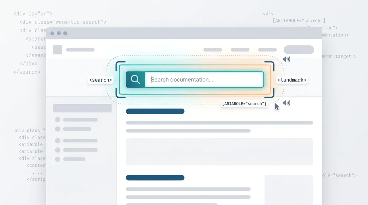
When and how to use the HTML search element
The HTML <search> element provides a semantic landmark for search and filtering interfaces without requiring ARIA roles. This article covers the exact criteria for when to use <search> versus a standard <form>, and how it impacts screen reader navigation.
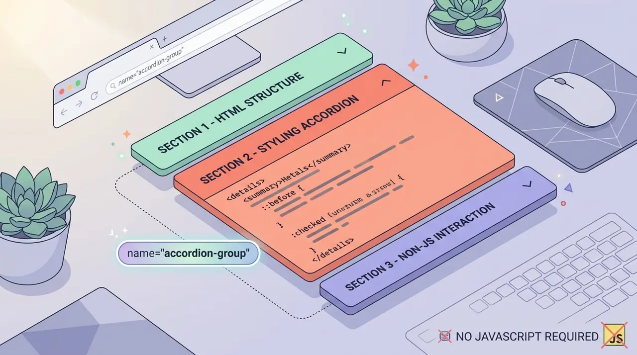
Building exclusive accordions natively with the HTML details name attribute
Developers have historically relied on JavaScript to create exclusive accordions where opening one panel closes the others. The new name attribute on the HTML details element solves this natively, allowing browsers to handle the state management.