How to build native carousels with CSS scroll-snap
CSS scroll snapping allows developers to create smooth, native carousels without JavaScript physics libraries. This article explains how to configure scroll-snap-type on containers and scroll-snap-align on children to control scroll resting points.
Paul Radford — Full-Stack Developer & Editor. Paul is a full-stack developer and editor of template.tips. Articles here are AI-drafted and reviewed by Paul, who knows the code well enough to catch what's wrong and cut the hype.
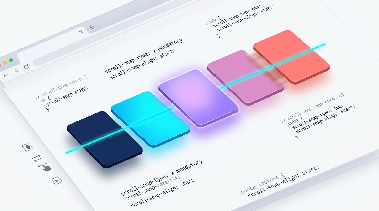
How to Build Native Carousels With CSS Scroll Snap
CSS scroll snapping lets the browser own the carousel mechanics: deceleration, resting position, touch momentum, all of it. Set scroll-snap-type on the scroll container and scroll-snap-align on its children, and you get a smooth, swipeable carousel with zero JavaScript and zero main-thread cost. It's shipped in every current browser and handles the common "slide through a row of items and stop on each one" case better than most JS carousel libraries. It won't autoplay or fade between slides, though, and it has real accessibility quirks for keyboard users that you need to design around deliberately rather than hope away.
The two halves of the mechanism
Scroll snapping only works because two separate declarations agree with each other. The container says "I want to snap," and the children say "here's where I rest."
1/* The scrolling container */2.carousel {3 display: flex;4 overflow-x: auto;5 scroll-snap-type: x mandatory;6 gap: 1rem;7 scrollbar-width: thin;8}910/* Each slide */11.carousel__item {12 flex: 0 0 85%;13 scroll-snap-align: start;14}1<div class="carousel">2 <img class="carousel__item" src="https://example.com/photo-1.jpg" alt="Mountain lake at sunrise" />3 <img class="carousel__item" src="https://example.com/photo-2.jpg" alt="Hikers on a ridge trail" />4 <img class="carousel__item" src="https://example.com/photo-3.jpg" alt="Tent camp under the stars" />5</div>scroll-snap-type: x mandatory tells the browser this container scrolls horizontally and must always come to rest on a snap point. scroll-snap-align: start tells it to align each child's start edge with the scrollport's start edge when snapping happens. That's genuinely the whole mechanism. No scroll listeners, no requestAnimationFrame easing loop, no library.
The MDN scroll-snap-type reference and MDN scroll-snap-align reference are worth reading end to end, because the axis and strictness values interact in ways a single example won't show you.
Should you use mandatory or proximity?
This is the decision that actually shapes how the carousel feels, and most tutorials treat it as a footnote.
scroll-snap-type: x mandatory forces the browser to land on a snap point after every scroll gesture ends, whether that's a flick, a drag, or a scrollbar click. There's no resting position between slides. Use this for a classic "one card at a time" carousel, like a hero banner or testimonial cards, where half of two slides showing at once looks broken.
scroll-snap-type: x proximity is softer. The browser only snaps if the gesture ends near an existing snap point. Let go mid-scroll in open space and the browser leaves it there instead of yanking the view to the nearest card. That feels calmer for loosely structured content, like a horizontal shelf of product thumbnails where snapping is a courtesy, not a requirement.
The practical trade-off:
- mandatory feels deliberate and app-like, but on fast trackpad flicks it can fight the user. A tiny gesture gets amplified into a full slide jump, which some people find jarring.
- proximity feels like normal scrolling, but users can end up resting between two items. That looks sloppy if your slides have hard edges or full-bleed background colors.
My default: mandatory for anything that behaves like a slideshow, one focal item at a time. proximity for anything that behaves like a scrollable shelf, several items visible at once. One rule worth internalizing: don't put mandatory snapping on a container whose children are themselves horizontally scrollable (nested scroll regions). Mandatory snapping can trap the outer gesture and make escaping the inner scroll area feel broken.
Controlling where slides rest with scroll-snap-align
scroll-snap-align accepts start, center, end, or none, measured against the scroll container's padding box on the relevant axis.
1/* Center-aligned carousel: peeking edges of neighboring2 slides stay visible on both sides of the active one */3.carousel--centered {4 display: flex;5 overflow-x: auto;6 scroll-snap-type: x mandatory;7 padding-inline: 10%; /* lets the first/last slide reach center */8}910.carousel--centered .carousel__item {11 flex: 0 0 80%;12 scroll-snap-align: center;13}center is what people reach for when they want that "peek at the next slide" look. It's a good effect, but remember the first and last slides can't physically reach the center of the viewport unless you add padding or spacer elements before the first item and after the last, because a scroll container can't scroll past its own content box. The padding-inline: 10% trick above is the cheapest fix. Just keep that padding roughly matched to the peek width you want, or the first and last slides will sit asymmetrically compared to the rest.
How do you handle a sticky header covering the snap point?
Here's the gotcha that catches nearly everyone the first time they pair scroll snapping with a sticky header or filter bar: the browser calculates snap positions against the scrollport, and the scrollport has no idea a position: sticky or position: fixed element is visually sitting on top of it. The content "correctly" snaps to the scrollport edge, but visually it lands right underneath your header, with the top chunk of the slide hidden.
scroll-margin (and its longhands, scroll-margin-top, scroll-margin-inline-start, and so on) solves this directly. It adds space that's factored into snap position and scrollIntoView() calculations without touching layout the way a normal margin would. See the MDN scroll-margin reference for the full property list.
1/* Sticky header sits above the scrolling content */2.site-header {3 position: sticky;4 top: 0;5 height: 64px;6 z-index: 10;7}89/* Vertical scroll-snap section list, common on story-style pages */10.sections {11 scroll-snap-type: y mandatory;12 overflow-y: auto;13 height: 100vh;14}1516.sections > section {17 scroll-snap-align: start;18 /* Push the snap point down so content doesn't19 land hidden behind the sticky header */20 scroll-margin-top: 64px;21 min-height: 100vh;22}The same fix applies to a horizontal carousel sitting next to a sticky sidebar: use scroll-margin-inline-start set to the sidebar's width. It's a one-line fix, but without it you get a carousel that looks off by a few pixels for reasons nobody on the team can immediately explain. I've fixed this exact bug on a production site where a 56px sticky nav was clipping the top of every slide, and scroll-margin-top: 56px was the entire patch.
Does scroll snapping break keyboard navigation?
This is the part that gets skipped in most write-ups, and it's where scroll-snap carousels most often fail an accessibility review.
A div with overflow-x: auto is keyboard-scrollable once focused (arrow keys, Page Up/Down, Home/End), which usually means adding tabindex="0". Scroll snapping doesn't turn that off, but it changes how it feels. With mandatory snapping, a small arrow-key nudge can suddenly jump a full slide width, because the browser snaps forward rather than leaving the scroll position mid-way. That's abrupt for keyboard users, and on a long carousel it can also feel sluggish, since small keyboard increments sometimes snap straight back to where they started if they don't cross the snap threshold.
A few fixes that actually matter in practice:
- Give the carousel real, focusable prev/next buttons that call scrollBy() or scrollIntoView(), instead of relying on raw arrow-key scrolling as the only control. This also gives you a place to put aria-label="Next slide" and real button semantics, which a bare scroll container can't provide on its own.
- Respect prefers-reduced-motion. Any programmatic scroll using scrollIntoView({ behavior: 'smooth' }) should fall back to an instant jump for users who've set that preference, since animated scrolling can trigger real discomfort for people with vestibular disorders. The web.dev guide to prefers-reduced-motion covers the detection pattern well.
1/* Respect reduced motion for any JS-triggered scrolling */2@media (prefers-reduced-motion: reduce) {3 .carousel {4 scroll-behavior: auto;5 }6}- Label the region for screen readers. A plain div full of images doesn't announce itself as a group of slides. role="region" with aria-label="Photo carousel" on the container, plus aria-roledescription="slide" on each item, covers most real cases. Don't build a full ARIA carousel pattern with live announcements and slide counters unless the product actually needs it; for a simple gallery, clear labeling and working buttons do the job.
- Test with a keyboard only, no mouse, no trackpad. Tab into the carousel, use arrow keys, and watch whether the focus ring stays visible as slides move. The common failure is a focused button scrolling out of view because its slide snapped away, leaving a keyboard user with no visible focus indicator anywhere on screen. If that happens, sync your scroll position to the focus event instead of leaving it purely to native scrolling.
One browser-specific nuance: Safari on iOS has historically been the pickiest implementation of this spec, occasionally overshooting by a few pixels during momentum scrolling on older iOS versions. That's largely cleaned up on current releases, but it's still a good reason to test on a real iPhone rather than trust desktop Safari or the simulator alone.
When scroll-snap is the wrong tool
Skip it if the carousel needs autoplay with pause-on-hover, cross-fade transitions between slides, or variable-height content that has to stay centered precisely as it resizes. All of that is possible with scroll-snap plus JavaScript glue, but at that point you're writing nearly as much code as a small carousel library would need anyway. Check actual engine support on caniuse.com before committing, especially if your product has to run inside an older embedded WebView, which sometimes lags behind the OS browser's CSS engine by a version or two.
Verifying the carousel actually works
Don't trust how it looks on your laptop. Before shipping, run through this:
- Resize the window and confirm slides still snap cleanly at narrow widths. A flex: 0 0 85% slide behaves very differently at 320px than at 1400px.
- Throttle the network in DevTools and reload. Snap position depends on layout, not image decode, so slides should still snap correctly before images finish loading.
- Enable "Emulate CSS media feature prefers-reduced-motion" in DevTools' Rendering tab and confirm your smooth-scroll fallback actually triggers.
- Tab through the whole carousel with a keyboard only. If focus disappears at any point, that's a shipping bug, not a nitpick.
- If you support older or embedded browsers, check the caniuse scroll-snap table against your actual analytics, not a guess at what your users run.
Get the mandatory-versus-proximity call right for the behavior you actually want, fix scroll-margin for any fixed chrome on the page, and put real effort into the keyboard path. Do those three things and you end up with a carousel that's lighter and faster than almost any JavaScript equivalent, built from a handful of CSS properties the browser has supported natively for years.
Related Articles
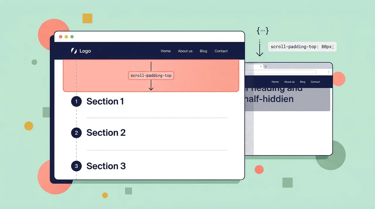
Fixing anchor link offset behind sticky headers with CSS scroll-padding
Explains how to use scroll-padding and scroll-margin to prevent anchor links from scrolling underneath fixed or sticky headers. Replaces old JavaScript offset calculations with native CSS.

Animating to height auto using CSS interpolate-size
height: auto was never a number the browser could interpolate toward, which is exactly why it never animated at all. These two features finally give the engine something concrete to target.

aspect-ratio: The Property That Changes How You Think About Responsive Layouts
The padding-top: 56.25% trick requires position: relative on the parent and breaks badly with images that haven't loaded yet. aspect-ratio collapses all of that into a single declaration.