Niche CSS Pseudo-Elements You Should Know: ::before Through ::highlight
Most developers use two or three CSS pseudo-elements regularly and forget the rest exist entirely. Here's what ::marker, ::backdrop, and ::highlight actually do, and where each one breaks.
Paul Radford — Full-Stack Developer & Editor. Paul is a full-stack developer and editor of template.tips. Articles here are AI-drafted and reviewed by Paul, who knows the code well enough to catch what's wrong and cut the hype.
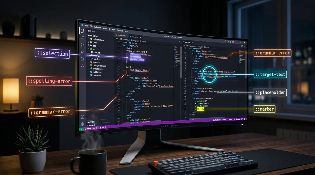
CSS pseudo-elements let you style or insert content at specific structural or state-based positions in the DOM without adding markup. Beyond the everyday ::before and ::after, a set of lesser-used pseudo-elements (::marker, ::placeholder, ::selection, ::backdrop, ::first-line, and the newer ::highlight) solve real UI problems that would otherwise require JavaScript or extra wrapper elements.
Most developers use two or three of these regularly and forget the rest exist. That is a mistake, because several of them remove entire categories of hacky markup. Here is what each one actually does, where it breaks, and when reaching for it is the wrong call.
Why does ::before still trip people up after years of use?
The confusion is rarely about syntax. It is about the box model and accessibility. ::before and ::after generate boxes that are children of the element, positioned inside its content box unless you change that with display or positioning. They require a content property or they render nothing at all, even if you set a background and dimensions.
1/* Generates a decorative box before every card title */2.card-title: :before {3 content: ";"; /* required, even if empty */4 display: inline-block;5 width: 1em;6 height: 1em;7 margin-right: 0.5em;8 background: currentColor;9 border-radius: 2px;10}The gotcha: content inserted this way is exposed to screen readers in some browser and assistive tech combinations, and hidden in others. Do not put meaningful text in content and assume it is invisible to everyone, and do not assume it is announced consistently either. If the content matters semantically, put it in the DOM. If it is purely decorative, add aria-hidden="true" to the parent context where feasible, though pseudo-elements themselves cannot carry ARIA attributes directly.
Another common miss: ::before and ::after do not work on replaced elements like <img>, <input>, or <video>, because those elements have no internal content box for the browser to render pseudo-content into. Trying to fake a badge on an <img> with ::after silently fails; wrap the image in a container instead.
Styling list markers without hacks: ::marker
Before ::marker shipped broadly, styling bullet color or number weight meant abandoning native list markers entirely and faking them with ::before on <li>. That approach breaks list semantics for screen readers in some setups and duplicates work every time content changes.
1/* Color and resize markers without touching list semantics */2li: :marker {3 color: #e63946;4 font-size: 1.1em;5 font-weight: 700;6}78/* Custom text markers per item */9li.warning: :marker {10 content: ";⚠ ";11}::marker only accepts a narrow set of properties: color, content, font properties, white-space, text-combine-upright, unicode-bidi, and direction. You cannot set margin, padding, or background on a marker box directly. If you need a fully custom bullet with spacing and a background, you are back to ::before with list-style: none on the parent. Support has been solid across Chromium, Firefox, and Safari since Safari 12.1 (2019) and Firefox 68, so this is safe to ship without fallbacks in 2026. See the MDN ::marker reference for the full property list.
Placeholder styling: what actually works cross-browser
::placeholder looks trivial until you try to change line-height or vertical alignment and nothing happens the way you expect.
1/* Safe, broadly supported placeholder styling */2input: :placeholder {3 color: #6b7280;4 opacity: 1; /* Firefox applies its own opacity by default */5 font-style: italic;6}Two gotchas worth knowing. First, Firefox historically applied a lower default opacity to placeholder text than Chromium browsers, so an explicit opacity: 1 avoids a washed-out look that only shows up in Firefox QA passes. Second, ::placeholder does not inherit font properties from the input the way you might expect in every engine, so set font-family and font-size explicitly if the placeholder needs to match the typed text exactly.
Selection and highlight: two different problems that look similar
::selection styles text the user has selected with a mouse or keyboard. ::highlight is newer and styles text ranges you define programmatically via the CSS Custom Highlight API, independent of user selection.
1/* Classic user text selection styling */2: :selection {3 background: #ffe066;4 color: #1a1a1a;5}::selection only supports a small property set too: color, background-color, text-decoration and its longhands, text-shadow, and a few others. You cannot set border or box-shadow on a selection box. That is a spec constraint, not a bug in your CSS.
::highlight is the interesting one for 2026. It pairs with the CSS.highlights JavaScript API to let you paint arbitrary text ranges (search matches, spell-check flags, code diff markers) without wrapping every match in a <span>.
1// Register a highlight for search-term matches without touching the DOM2const range = new Range();3range.setStart(paragraphNode, 10);4range.setEnd(paragraphNode, 24);56const highlight = new Highlight(range);7CSS.highlights.set("search-match", highlight);1/* Style the highlight registered above by name */2: :highlight(search-match) {3 background-color: #fff3bf;4 color: #212529;5}This is genuinely useful for editor-like interfaces, in-page search, and annotation tools, because it avoids DOM mutation and the reflow cost that comes with wrapping text in spans repeatedly as a user types a search query. The trade-off is browser support: as of early 2026, ::highlight and the Custom Highlight API work in Chromium-based browsers (Chrome and Edge, shipped since Chrome 105) and Safari (since Safari 17.2), but Firefox support landed later and behind slower rollout, so check caniuse for the Custom Highlight API before relying on it for a feature with no fallback path. If the feature is cosmetic, layer it as an enhancement. If it is core functionality like search-match highlighting, keep a <mark>-based fallback for browsers that lack support.
Overlay backdrops: ::backdrop for dialogs and full-screen elements
::backdrop styles the layer rendered behind a <dialog> opened with showModal(), or behind an element in fullscreen mode. It is one of the cleanest wins in this list because it replaces a manual fixed-position overlay div plus z-index management.
1/* Dim and blur the page behind an open modal dialog */2dialog: :backdrop {3 background: rgba(15, 15, 20, 0.6);4 backdrop-filter: blur(2px);5}The gotcha: ::backdrop only exists while the dialog is open via showModal(). A <dialog> shown with the open attribute alone, or with .show() instead of .showModal(), gets no backdrop at all, because it is not treated as top-layer content. Developers frequently file this as a bug when it is actually spec behavior described in the WHATWG HTML dialog element spec.
First-line and first-letter: typographic polish with layout side effects
::first-line and ::first-letter are old pseudo-elements but still underused for editorial layouts, drop caps, and lede paragraphs.
1/* Classic drop-cap treatment */2article p: first-of-type::first-letter {3 font-size: 3.2em;4 float: left;5 line-height: 0.8;6 padding-right: 0.1em;7 font-weight: 700;8}The catch with ::first-line specifically: it recalculates on every reflow, including window resize and font loading. If you set aggressive letter-spacing or font-size changes on ::first-line, you can get visible layout jumps as web fonts swap in via font-display: swap. Test with throttled network conditions, not just a warm cache, because the failure mode only shows up on first load.
Testing these in a real project
Do not trust a single browser during development. Open the same page in at least one Chromium browser, Safari (or a Safari-compatible testing service if you are on Windows or Linux), and Firefox, and specifically check marker color, placeholder opacity, and backdrop rendering, since these three are the most likely to diverge silently. For ::highlight, feature-detect with "highlights" in CSS before calling the API, and render your fallback markup server-side so users on unsupported browsers never see a broken or empty state.
For accessibility, run a screen reader pass (VoiceOver on Safari, NVDA on Firefox or Chrome) over any page using ::before or ::after for anything beyond pure decoration. If the announced content differs from what sighted users see, move that content into real DOM nodes and use the pseudo-element for styling only. The MDN pseudo-elements overview is the fastest reference for the full property allow-list per pseudo-element when you hit one of these narrow-support walls mid-project.
Related Articles

How to use the advanced CSS attr() function for types and units
attr(data-color color, #333) feeding straight into background-color sounds like it already ships, but as of early 2026 it's spec-only. Here's what attr() actually does today, and what's coming.

CSS 'toggle()' Function: Conditional Styling Without @when
toggle() and @when get conflated constantly in blog posts despite solving completely unrelated problems. Neither ships in a browser yet, so here's what actually works today instead.

Animating to height auto using CSS interpolate-size
height: auto was never a number the browser could interpolate toward, which is exactly why it never animated at all. These two features finally give the engine something concrete to target.