Modern HTML Forms: What Developers Are Still Doing Wrong
Modern HTML Forms: What Developers Are Still Doing Wrong

Most form bugs in production come from three habits: reaching for JavaScript before checking what HTML already validates natively, styling form controls in ways that strip out accessibility semantics, and treating <form> submission as an afterthought instead of the primary interaction. Fixing these three things solves the majority of real-world form complaints.
Why Are Developers Still Reinventing Validation?
Native form validation has been solid since Chrome and Firefox shipped the Constraint Validation API around 2010-2011, yet a huge share of production forms still rely on custom JavaScript to check whether an email field is empty. This usually happens because teams inherited a validation library from a design system and never audited whether it duplicates what the browser already does for free.
The Constraint Validation API gives you required, pattern, min, max, minlength, maxlength, and type-based checks (email, url, number) without a single line of script. It also exposes validity states you can hook into for custom messaging:
1<!-- Native validation with a custom error message -->2<form id="signup">3 <label for="email">Work email</label>4 <input5 type="email"6 id="email"7 name="email"8 required9 placeholder="you@company.com"10 />11 <span class="error" aria-live="polite"></span>1213 <button type="submit">Create account</button>14</form>1516<script>17 const form = document.getElementById('signup');18 const email = document.getElementById('email');19 const errorSpan = email.nextElementSibling;2021 email.addEventListener('invalid', (e) => {22 e.preventDefault(); // stop the default bubble tooltip if you want custom UI23 if (email.validity.valueMissing) {24 errorSpan.textContent = 'Email is required.';25 } else if (email.validity.typeMismatch) {26 errorSpan.textContent = 'Enter a valid email address.';27 }28 });2930 email.addEventListener('input', () => {31 if (email.validity.valid) errorSpan.textContent = '';32 });33</script>The mistake isn't using JavaScript, it's using JavaScript to replicate required and type="email" from scratch, then forgetting to keep the accessible error announcement in sync with what the browser is already tracking in validity. Read the MDN Constraint Validation guide before writing a custom validator; there's a good chance the spec already covers your case.
Autocomplete Attributes Are Not Optional Polish
autocomplete gets treated as a nice-to-have, something you add if there's time left in the sprint. That's backwards. For anything resembling checkout, signup, or address entry, autocomplete is a functional requirement, not decoration. Browsers and password managers use these tokens to populate fields correctly, and getting them wrong causes real drop-off, especially on mobile where retyping a card number is painful.
The token values are standardized in the WHATWG HTML spec, and they're more granular than most developers assume: cc-number, shipping street-address, bday-year all exist. A generic autocomplete="off" slapped on a whole form to "fix" browser autofill is almost always the wrong move; it degrades UX for password managers and defeats built-in browser heuristics for no real security benefit, since off is not reliably honored by browsers on login fields anyway.
1<!-- Correct, granular autocomplete tokens -->2<form>3 <input type="text" name="cc-name" autocomplete="cc-name" />4 <input type="text" name="cc-number" autocomplete="cc-number" inputmode="numeric" />5 <input type="text" name="cc-exp" autocomplete="cc-exp" placeholder="MM/YY" />6 <input type="text" name="cc-csc" autocomplete="cc-csc" inputmode="numeric" />7</form>Note inputmode="numeric", which tells mobile keyboards to show a numeric layout without changing the field's actual type or breaking paste behavior the way type="number" does on credit card fields (which also adds unwanted spinner controls in most browsers).
Should You Style Native Controls or Rebuild Them?
This is the question that causes the most damage. Teams see a design comp with a custom checkbox or select, and the default move is to hide the native control with opacity: 0 or display: none and build a fully custom widget with divs and ARIA roles. This is almost always more work than necessary and frequently ships broken accessibility, because reimplementing keyboard handling, focus management, and screen reader semantics for something like a <select> is genuinely hard to get right.
The better default: style the native element directly wherever the CSS allows it, and only build a custom widget when the interaction truly cannot be expressed by native HTML (a multi-select combobox with async search, for example).
As of 2026, CSS gives you real tools here. accent-color lets you recolor checkboxes, radios, and range sliders without touching markup:
1/* Recolor native controls without rebuilding them */2input[type="checkbox"],3input[type="radio"] {4 accent-color: #6d28d9;5}And the newer <select> styling capabilities (the customizable select via appearance: base-select and the ::picker() pseudo-element) are landing in Chromium-based browsers starting around Chrome 133-134, letting you restyle the dropdown popup itself while keeping native keyboard and screen reader behavior intact. This is still not supported in Firefox or Safari as of early 2026, so treat it as progressive enhancement, not a baseline dependency. Check caniuse for customizable select style feature coverage before committing a whole design system to it, and always ship a functional fallback for browsers that ignore the new pseudo-elements.
If you do need a fully custom widget (a color picker with a swatch grid, say), don't skip the ARIA authoring practices. The ARIA Authoring Practices Guide combobox pattern documents exact keyboard interactions expected by screen reader users; deviating from it silently breaks the experience for a population of users you'll never hear complaints from because they simply give up.
What Happens When JavaScript Fails or Is Slow?
A form that only works after a JavaScript bundle finishes parsing is a form that fails for a nontrivial slice of real traffic: users on flaky mobile connections, corporate networks with aggressive script blocking, or anyone hitting your site during a CDN hiccup. Progressive enhancement isn't nostalgia, it's risk management.
The baseline test: does the form submit and produce a sensible server response with JavaScript completely disabled? If the answer is no, you have a single point of failure sitting on your critical conversion path.
1<!-- Works with plain HTML submission, enhanced later with fetch -->2<form action="/api/subscribe" method="post" id="subscribe-form">3 <input type="email" name="email" required autocomplete="email" />4 <button type="submit">Subscribe</button>5</form>67<script>8 const form = document.getElementById('subscribe-form');9 form.addEventListener('submit', async (e) => {10 e.preventDefault();11 const data = new FormData(form);12 try {13 const res = await fetch(form.action, { method: 'POST', body: data });14 if (!res.ok) throw new Error('Request failed');15 form.replaceWith(document.createTextNode('Thanks, check your inbox.'));16 } catch (err) {17 // fall back to a real submission if fetch fails18 form.submit();19 }20 });21</script>This pattern costs almost nothing extra to write and gives you a graceful degradation path instead of a dead button. It also plays much better with password managers and browser autofill heuristics, since a real <form> with action and method is what those tools are designed to recognize.
The novalidate and Custom Error UI Trap
One recurring bug: teams add novalidate to a form so they can build custom error styling, then forget to re-implement the actual validation logic, or implement it inconsistently across fields. If you add novalidate, you are opting out of the browser's built-in checks entirely, including type coercion for type="number" and pattern matching. You now own all of it. Test this explicitly rather than assuming your custom validator mirrors native behavior; edge cases like leading/trailing whitespace in email fields or locale-specific decimal separators in number fields are easy to miss.
How to Actually Test a Form Before Shipping It
Run these checks before merging any form change, not just at the end of a project:
Submit the form with JavaScript disabled in dev tools and confirm the server response is usable, even if it's a plain redirect.
Tab through every field using only the keyboard, no mouse, and confirm focus order matches visual order and every interactive element is reachable.
Turn on a screen reader (VoiceOver on macOS, NVDA on Windows) and listen to how labels, error messages, and required-field announcements come through. If an error appears visually but nothing is announced, your aria-live region isn't set up correctly.
Test autofill by saving a fake address or card in your browser's password manager settings, then load the form and trigger autofill to confirm fields populate into the right inputs.
Resize the viewport down to 320px width and check that error messages don't get clipped or overlap adjacent fields, a common casualty of custom validation UI that wasn't tested at small breakpoints.
None of this requires special tooling. It requires treating the form as a piece of infrastructure that real people depend on, not a component that just needs to look right in the Figma file.
Related Articles
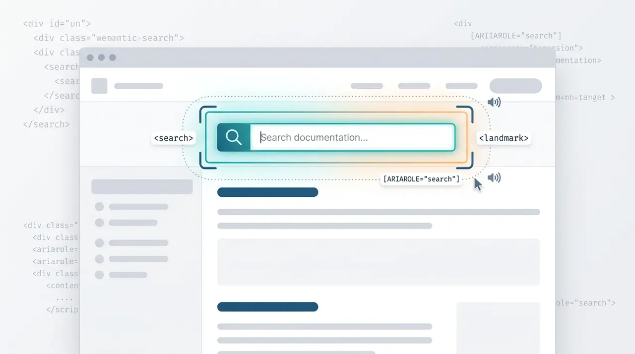
When and how to use the HTML search element
The HTML <search> element provides a semantic landmark for search and filtering interfaces without requiring ARIA roles. This article covers the exact criteria for when to use <search> versus a standard <form>, and how it impacts screen reader navigation.
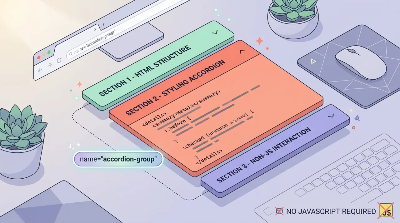
Building exclusive accordions natively with the HTML details name attribute
Developers have historically relied on JavaScript to create exclusive accordions where opening one panel closes the others. The new name attribute on the HTML details element solves this natively, allowing browsers to handle the state management.