CSS animation-composition: Controlling Layer Merge Behavior
A hover-triggered scale pulse used to kill a continuous background rotation animation outright the instant it started. This property lets both effects combine instead of one overriding the other.
Paul Radford — Full-Stack Developer & Editor. Paul is a full-stack developer and editor of template.tips. Articles here are AI-drafted and reviewed by Paul, who knows the code well enough to catch what's wrong and cut the hype.
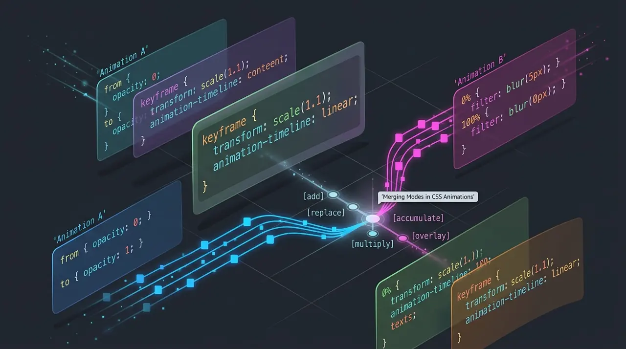
The animation-composition property controls how multiple CSS animations targeting the same property combine their effects on an element. Set it to replace (default), add, or accumulate to decide whether a new animation overrides, layers on top of, or builds upon the value produced by earlier animations on that same property.
If you have never needed this property, you are not alone. Most developers write one animation per property per element and never think about conflicts. The problem shows up the moment you try to compose effects, like a continuous rotation animation plus a separate hover-triggered scale pulse, both touching transform. Without animation-composition, the second animation simply replaces the first, and your rotation stops dead the instant the hover animation starts.
What problem does animation-composition actually solve?
CSS animations have always been able to run in parallel on different properties. Run a translateX animation and an opacity animation at the same time and they coexist fine, because they touch different properties. The trouble starts when two animations target the same property, especially transform or filter, which are common targets for layered motion effects.
Before this property existed, the browser's default behavior was to let the last-applied animation win outright. If you stacked a spin animation and a pulse animation, both animating transform, the pulse would completely replace the spin's rotation value the moment it became active. You could not get a rotating element to also pulse, not through pure CSS composition anyway. Developers worked around this with nested wrapper elements, one for each transform effect, which works but bloats markup and complicates layout calculations.
animation-composition lets the browser combine the underlying value lists mathematically instead of throwing one away. This matters most for transform, filter, backdrop-filter, and other properties that accept lists of functions, since those are the properties where "add the effects together" makes visual sense.
The three composite values and what they actually do
replace is the default and matches legacy behavior: the animation with the highest priority (later in the animation-name list, or a later-starting animation) fully overwrites earlier values for that property. Nothing carries over.
add places the new animation's transform functions after the existing ones in the transform list, rather than overwriting them. For transform, this means both sets of functions apply, since CSS transforms compose left to right. A rotate animation plus an add-composited scale animation produces an element that rotates and scales at once.
accumulate is subtly different from add. Where possible, it merges same-type functions numerically instead of just appending them. Two translateX animations set to accumulate will sum their translation distances rather than listing two separate translate functions. For values that cannot be meaningfully summed (like two different rotate3d axes), accumulate falls back to behavior similar to add.
In practice, add is what you reach for most often. accumulate shines in narrower cases, like layering multiple looping translate or scale animations where you actually want the numeric values to stack (for instance, a "shake" animation accumulating on top of a constant drift).
How do you actually combine two transform animations?
Here is the classic case: a continuous spin plus a hover-triggered pulse, both animating transform.
1/* Base rotation, running indefinitely */2.icon {3 animation: spin 4s linear infinite;4 animation-composition: add; /* Let later animations layer on top */5}67@keyframes spin {8 from { transform: rotate(0deg); }9 to { transform: rotate(360deg); }10}1112/* Hover-triggered scale pulse, composited on top of the spin */13.icon: hover {14 animation: pulse 0.6s ease-in-out infinite;15 animation-composition: add;16}1718@keyframes pulse {19 0%, 100% { transform: scale(1); }20 50% { transform: scale(1.15); }21}Without animation-composition: add on the hover rule, hovering would kill the spin's rotation entirely for the duration of the hover, since pulse would replace the transform list outright. With add, the browser keeps rotating the element and layers the scale on top, so you see rotation and pulsing simultaneously.
Order matters here. add appends the incoming animation's value to the end of the existing transform function list. Since transform functions apply left to right, appending a scale after a rotate gives you rotate-then-scale composition, which is usually what you want visually. If you need scale-then-rotate, you will need to restructure which animation is considered "later" or use accumulate and matching function types.
Where accumulate changes the outcome
Consider two looping animations that both translate an element horizontally, one slow and continuous, one a fast jitter meant to sit on top of it.
1/* Slow continuous drift across the container */2.particle {3 animation: drift 8s linear infinite;4 animation-composition: accumulate;5}67@keyframes drift {8 from { transform: translateX(0px); }9 to { transform: translateX(300px); }10}1112/* Fast jitter meant to sum with the drift, not just sit beside it */13.particle.active {14 animation: jitter 0.15s ease-in-out infinite;15 animation-composition: accumulate;16}1718@keyframes jitter {19 0%, 100% { transform: translateX(0px); }20 50% { transform: translateX(6px); }21}With accumulate, the browser recognizes both animations produce translateX functions and sums the distances numerically at each frame, giving you a smooth drift with a jitter riding on top of it as one continuous translation value. Swap accumulate for add here and you would instead get two separate translateX() functions chained in the transform list, for example translateX(180px) translateX(3px), which resolves visually to the same net position in this specific case, but stops matching mathematically once you mix in rotation or scale functions where order and combination rules diverge from simple addition.
A caveat worth knowing before you rely on this
animation-composition only affects how CSS animations composite with each other and with the underlying specified value. It does not extend to compositing with regular inline styles or JavaScript-driven changes to the same property outside of the Web Animations API's animation stack; those still follow normal cascade and specificity rules, and a directly set style.transform from JavaScript will simply override the animated value rather than merging with it. If you need JavaScript-driven values to compose with CSS animations, you need to run that logic through the Web Animations API using Element.animate(), where composite behavior can be set per-keyframe via the composite option, matching the same replace, add, and accumulate semantics.
Browser support is solid but not universal at every version boundary. Firefox shipped support in Firefox 115 (mid-2023). Chrome and Chromium-based browsers (Edge, Opera, Brave) picked it up starting in Chrome 112, also in 2023. Safari added support in Safari 17.0, released in September 2023. As of early 2026, this puts animation-composition safely inside the range you can use for progressive enhancement in most production codebases, though if you have hard support requirements for browsers older than late 2023 you should check caniuse for your specific baseline before depending on it for anything load-bearing. Always test the fallback behavior; browsers without support will simply ignore the declaration and default to replace, meaning your layered effect degrades to the old "last animation wins" behavior rather than throwing an error. Design your keyframes so that degradation is acceptable, not broken.
Deciding when to reach for this versus restructuring your markup
The wrapper-element workaround, where each transform effect gets its own nested container, still works everywhere and is sometimes the better choice, especially if you need to support anything not aligned with the browser versions above, or if your composited transforms need to interact with layout in ways that composited CSS values do not handle well (for instance, if a sibling element needs to react to the combined visual bounding box). Wrapper elements also make debugging in DevTools more intuitive, since each transform is isolated to one element in the layout tree.
Reach for animation-composition when your target browsers are covered, when the animations genuinely belong on the same element semantically (a button that spins and also pulses is one interactive object, not two), and when you want to avoid the DOM overhead and CSS specificity headaches that come from wrapping every animated element in an extra div. It is also the right tool when you are animating via a component library or design system where adding wrapper markup for every consumer is impractical, and you would rather solve the composition problem in the stylesheet.
To verify the behavior in your own project, open DevTools, inspect the computed transform value on the animated element while both animations are running, and confirm it reflects both effects rather than just the most recent one. Chrome's Elements panel shows the live computed transform matrix, which is the most reliable way to catch a silent fallback to replace if a browser or a typo in your CSS causes composition to fail quietly. Check the MDN reference for animation-composition for the full value syntax, and consult the CSS Animations Level 2 specification if you need the precise algorithm for how function lists merge, particularly if you are debugging an edge case involving mismatched function types between two animations.
Related Articles

Animating to height auto using CSS interpolate-size
height: auto was never a number the browser could interpolate toward, which is exactly why it never animated at all. These two features finally give the engine something concrete to target.

Styling the View Transitions API with CSS: Beyond the Default
During a view transition you're animating still screenshots, not live DOM nodes, a detail most tutorials skip. It explains almost every 'why doesn't this work' question you'll hit later.

How to use the advanced CSS attr() function for types and units
attr(data-color color, #333) feeding straight into background-color sounds like it already ships, but as of early 2026 it's spec-only. Here's what attr() actually does today, and what's coming.